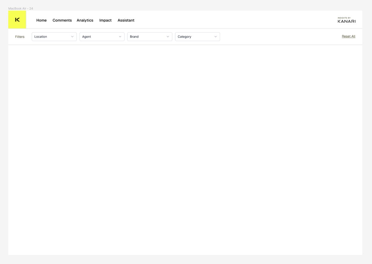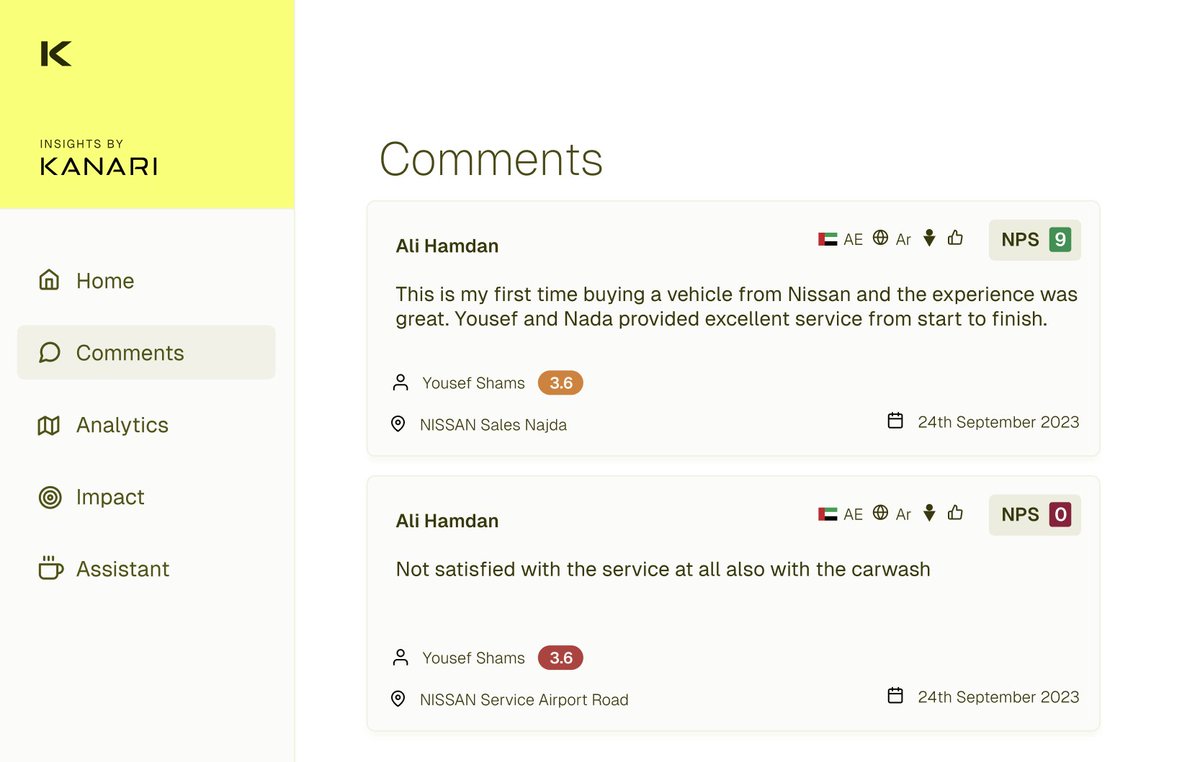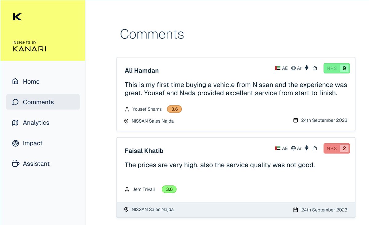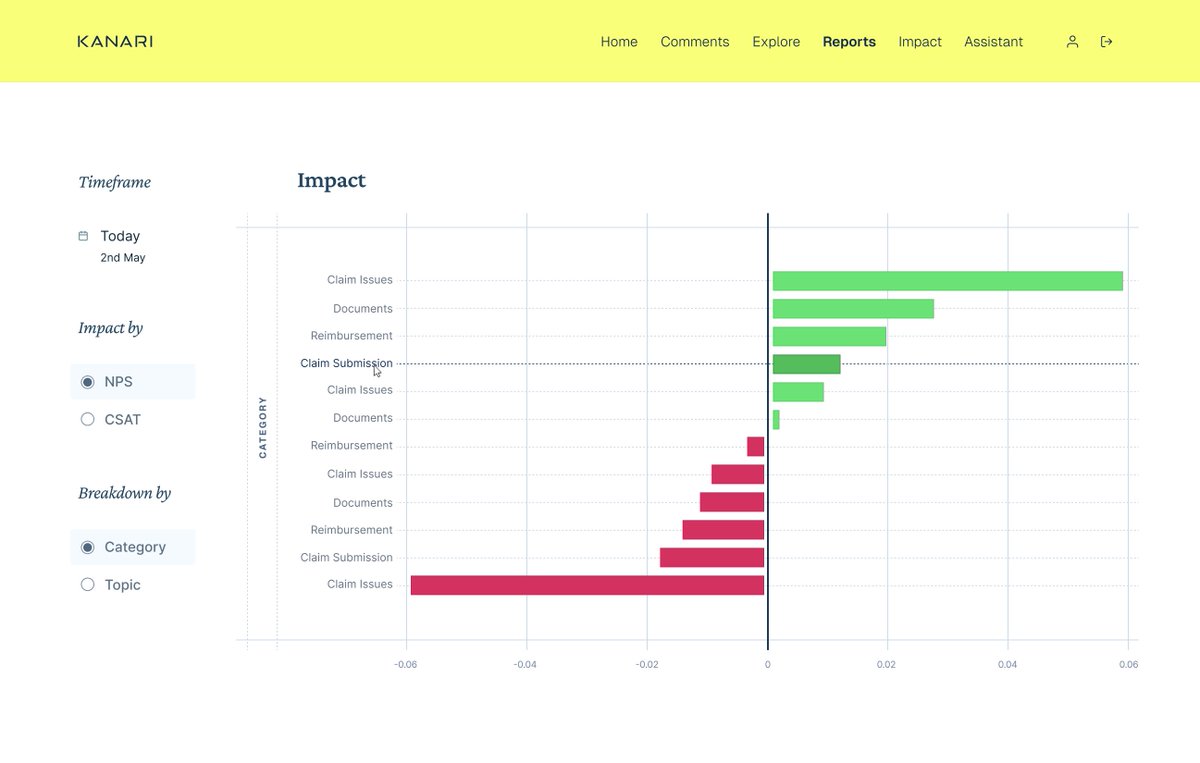

Starting my next project in public! This one is a design only sprint, for a Customer Analytics platform called Kanari run by @subhif out of Dubai Really excited about this project Follow to see how it turns out :)
PIXELS ON GRIDS
Kanari is a Customer Experience analytics platform run by @subhif out of Dubai, helping companies measure CX across the customer journey — from sales through delivery and beyond.
I have been designing and building the Kanari dashboard since April 2024, in public, one thread at a time. Below is that full archive, pulled straight from the tweets — brainstorms, sketches, palette exploration, dashboard iterations, the analytics module, saved reports, and the case management redesign that followed a year later.
Starting my next project in public! This one is a design only sprint, for a Customer Analytics platform called Kanari run by @subhif out of Dubai Really excited about this project Follow to see how it turns out :)
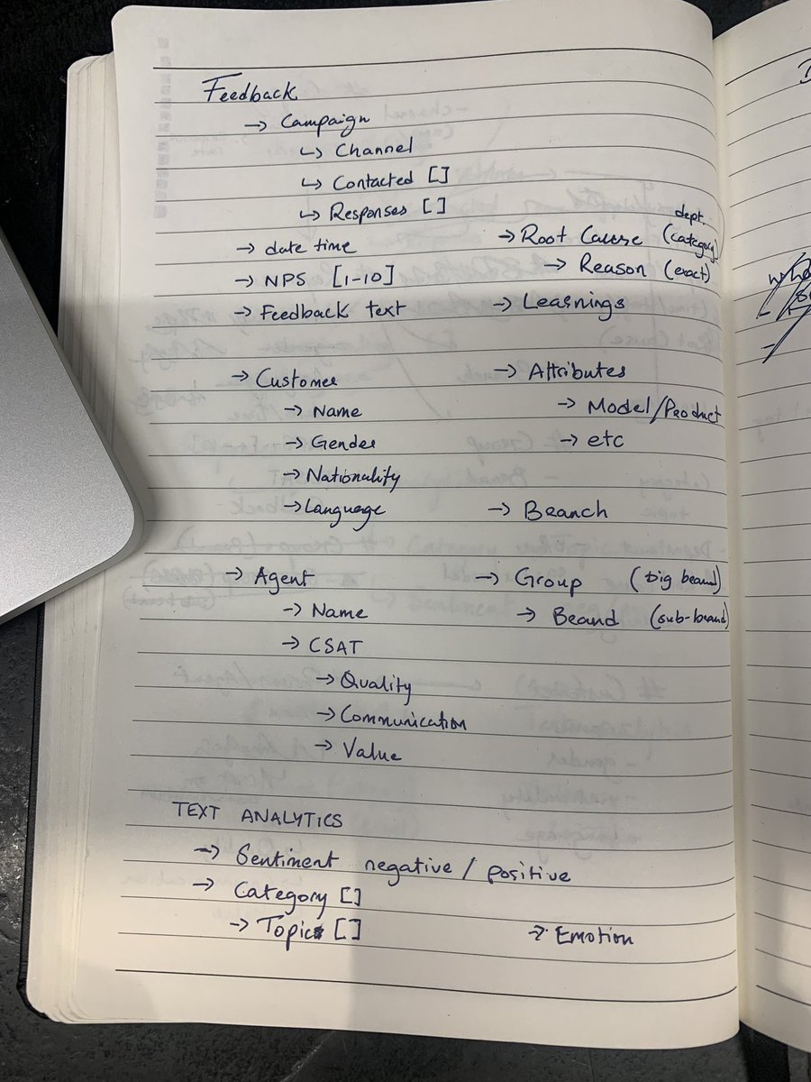
This week I’ve been designing the new Kanari dashboard for @subhif The first step of designing a dashboard that is easy to understand but also powerful is to understand the data structures were interacting with.
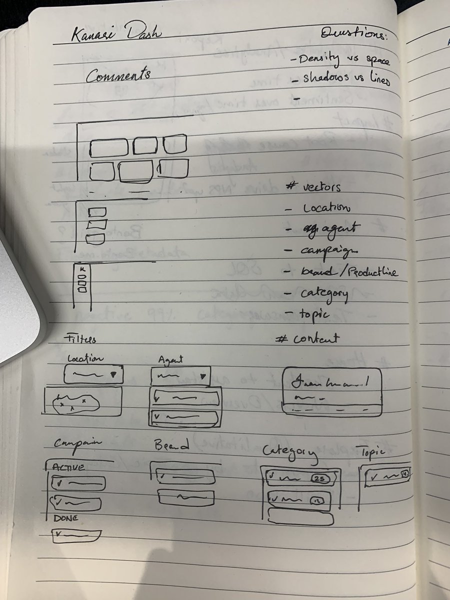
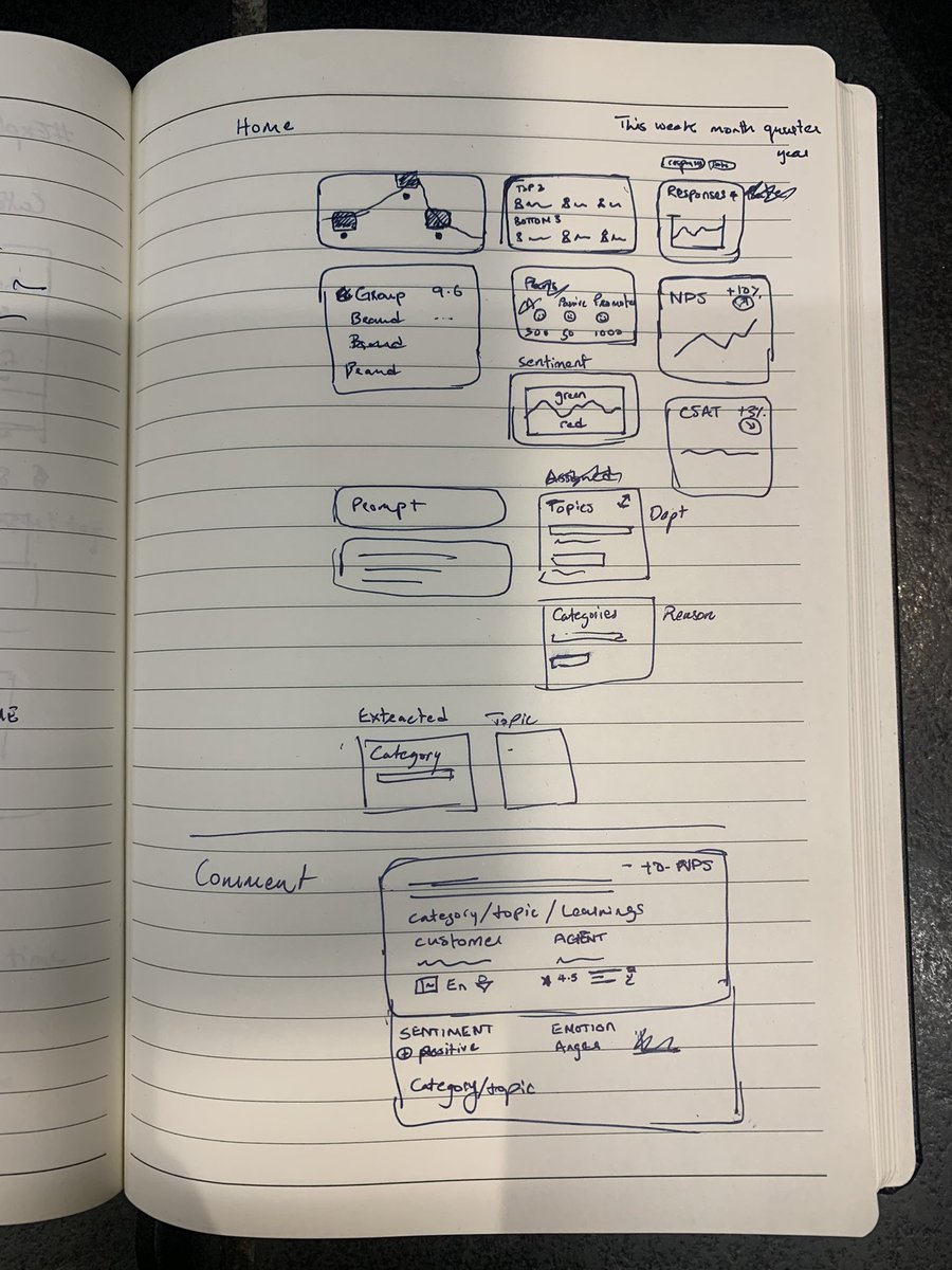
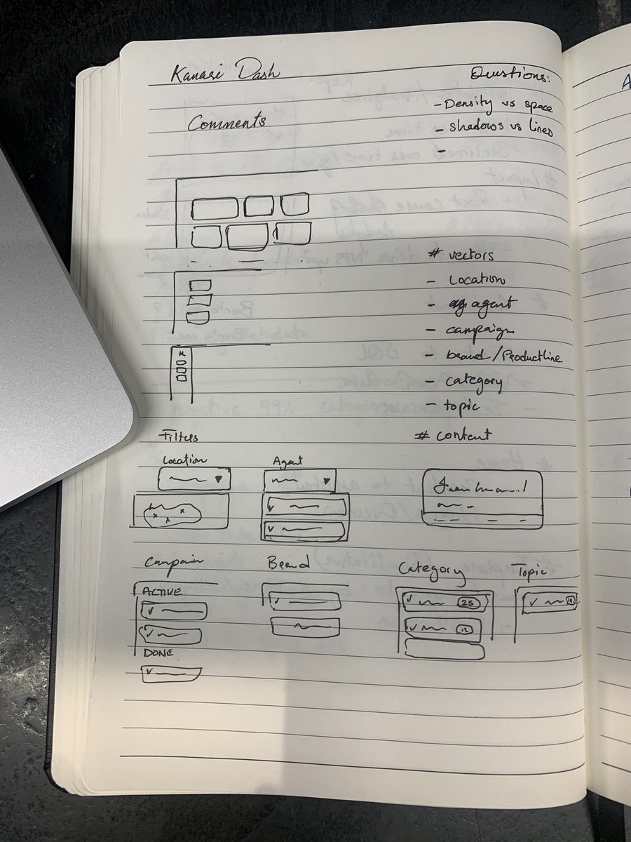
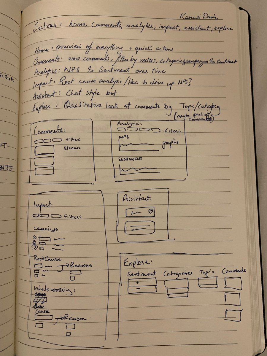
After speaking with the client, we also have an idea of what the different sections will look like So for each of the sections I’m starting to play around with concepts on paper To see what has to be on that page but to also find all the variations that are possible
A design project is harder to document but I’m excited to share this project with you all! Follow to see how this all turns out!
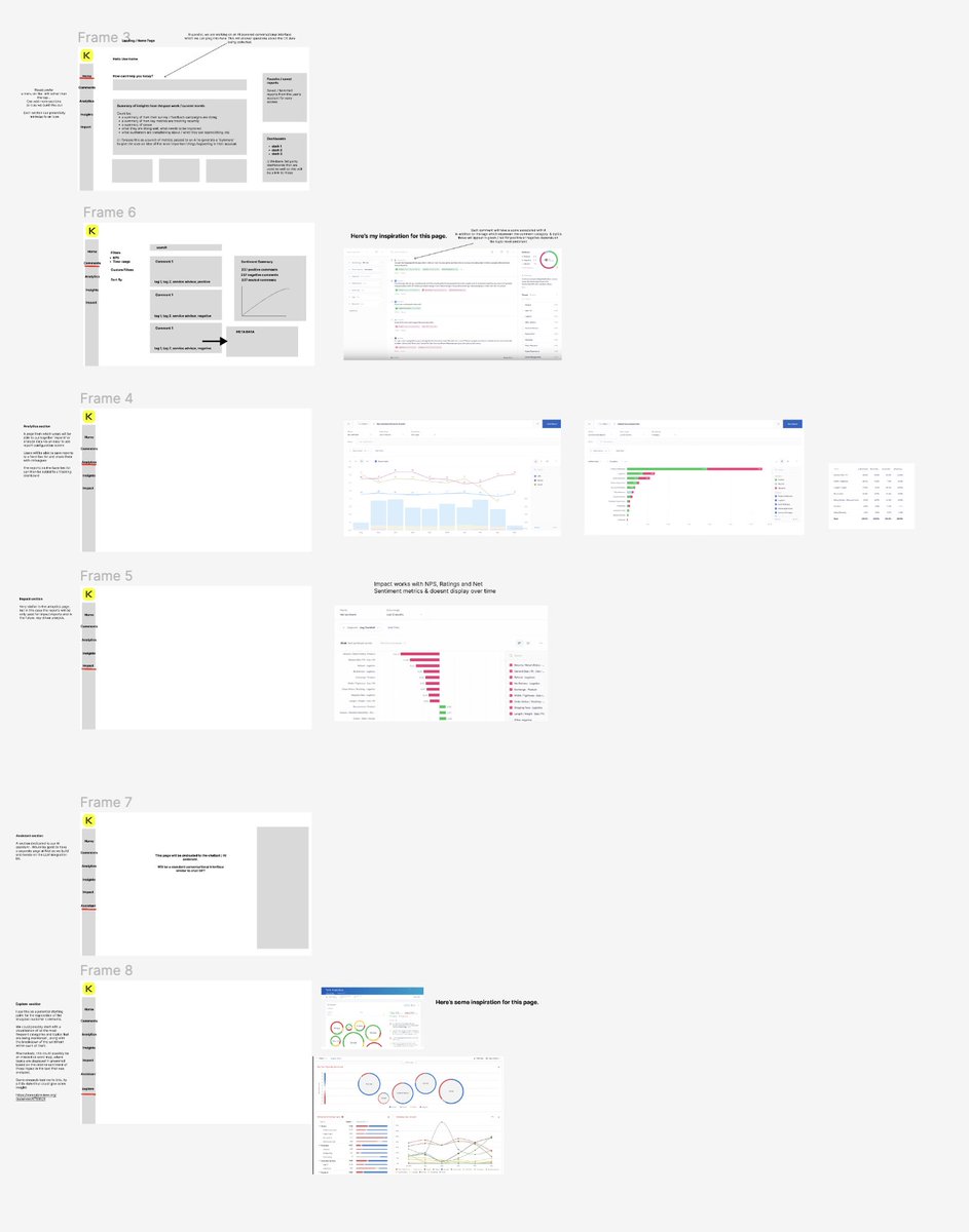
Before we even started the Kanari Dashboard project with @subhif, we did a little brainstorm session setting a general direction and scope for the project This is what that document looked like It's one of many steps where we take ideas in our heads and turn it into real scope
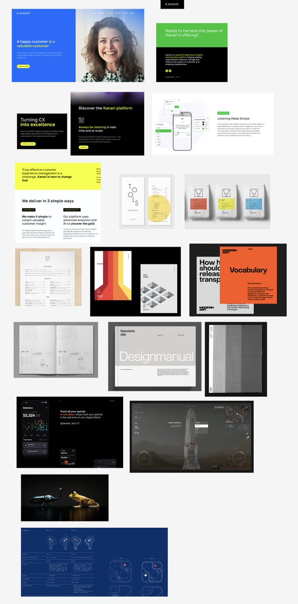
Another thing I usually do before a design project is to look through work I like and might be relevant to this project It's like a "mood board" of sorts, but more than that it's allowing the mind to understand what's possible, review design trends and just get inspired
I've never shared my design process in public before a) It's hard to document, a lot of it is doodling, messing around, thinking, problem solving b) There is a magic to seeing the end result, but process can look very dry and almost unimpressive But I'll share anyways..
For example, this is me exploring one style of layout
Eventually reaching a style that I quite like
The goal with trying different styles is to just explore what we could get to The end result might look very different to this, but design is a process of iteration, and you cannot get to the end result without exploring ideas that you don't even plan to use
There are so many ways you can layout a page, some will work better than others Towards the middle of the project, we'll become a lot more strict with the direction, but for now it's all about being open to what's possible
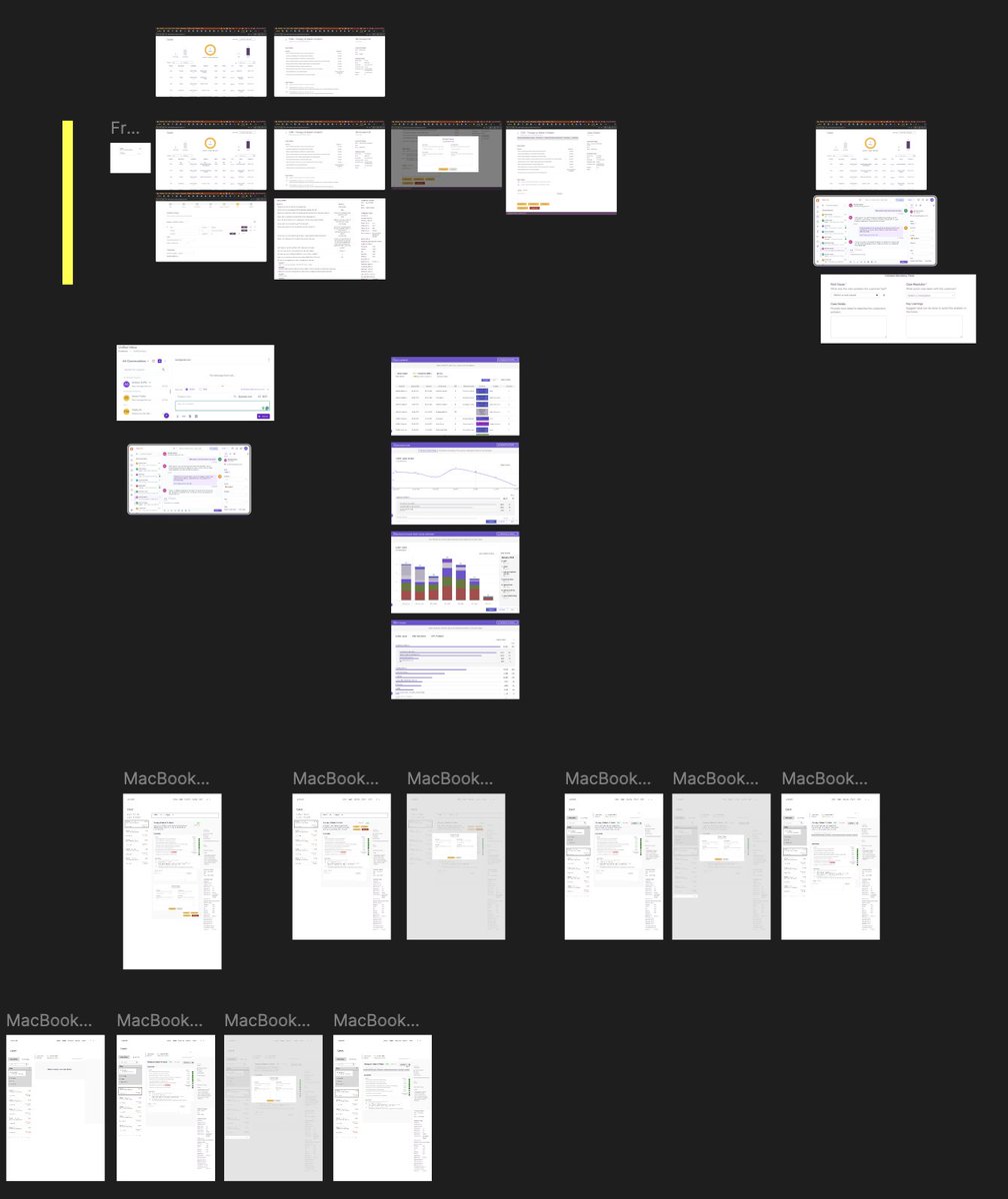
This week I've been designing a dashboard for @subhif's customer analytics firm Since it's a data heavy design, I had to take a step back and understand the schemas/data structures we're dealing with Then I wireframed UIs on paper for each of the sections Here's an overview
Now it's time to take all of this into Figma Sketches on paper don't have any personality, so before we can map out entire flows in Figma, we need to do some explore aesthetics and see what these flows need to look like
We already tried some layouts like this
And after exploring more ideas like this one
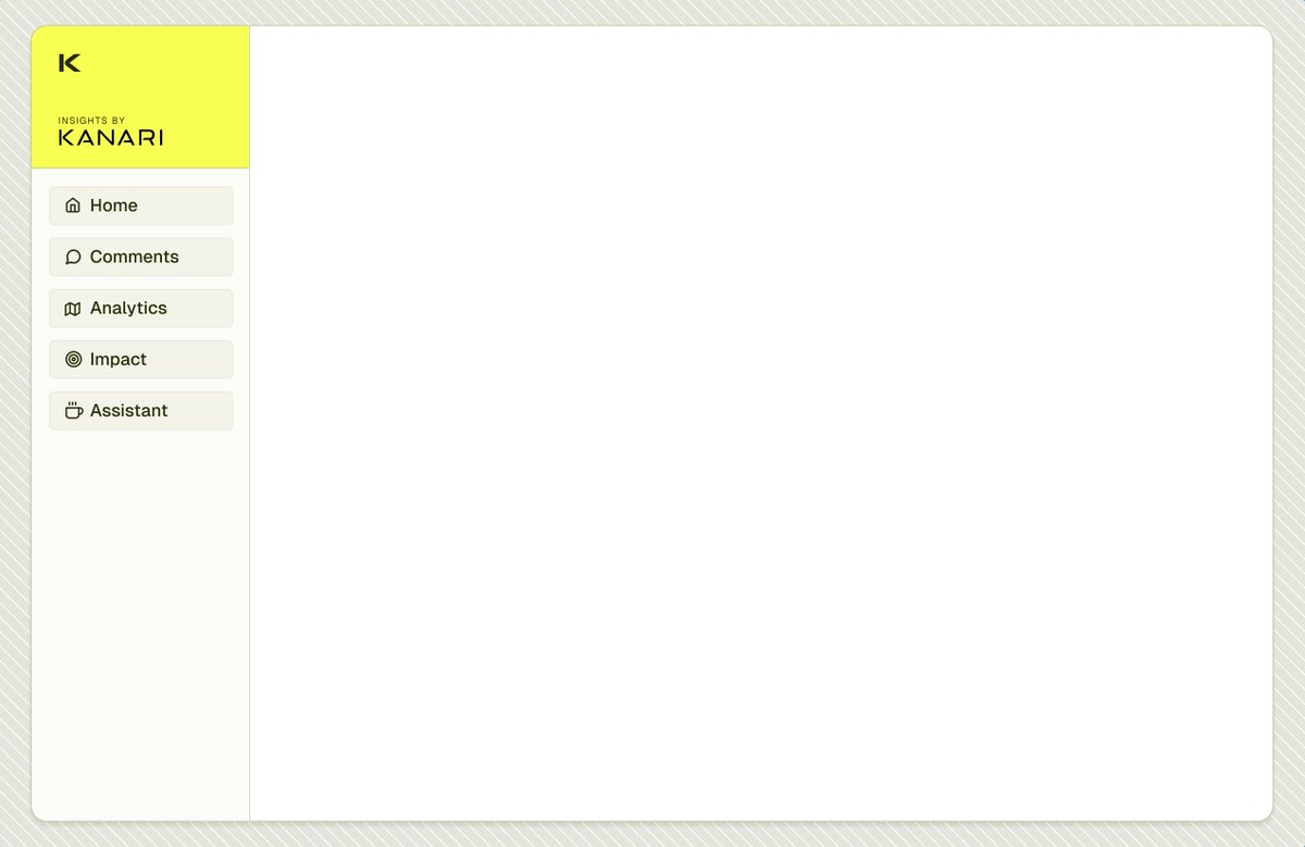
I realized I wasn't loving the color scale, among a few other things The keen of you will notice that the entire scale is in yellow, from the sidebar background to the darker yellow for text but something about yellows here makes it feel dull, dated & lacking that "clean" look
With a bit of playing around, I found a palette that works a lot better with the brand color (yellow), without having to use the yellow everywhere This shade of blue, which has a lot of lightness to it makes it feel a lot fresher And you'll see why this makes a big difference
For example, when playing around with component ideas, the yellows really start to not work in a big way Whereas the blues work a ton better and have a freshness to it that brings about a "cleaner" look (one of the goals for the design)
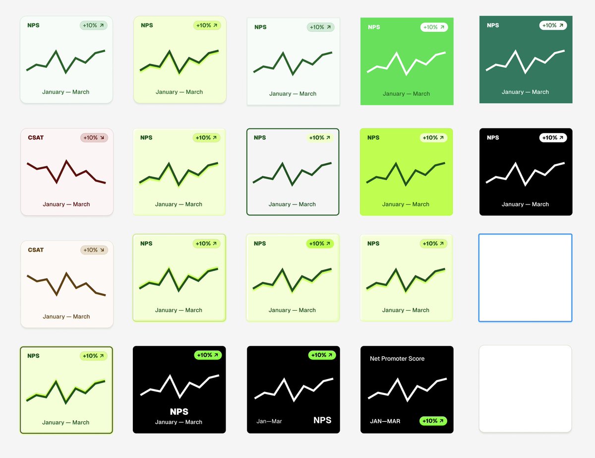
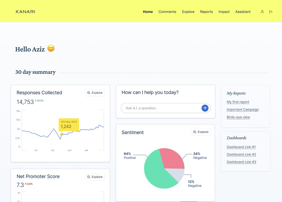
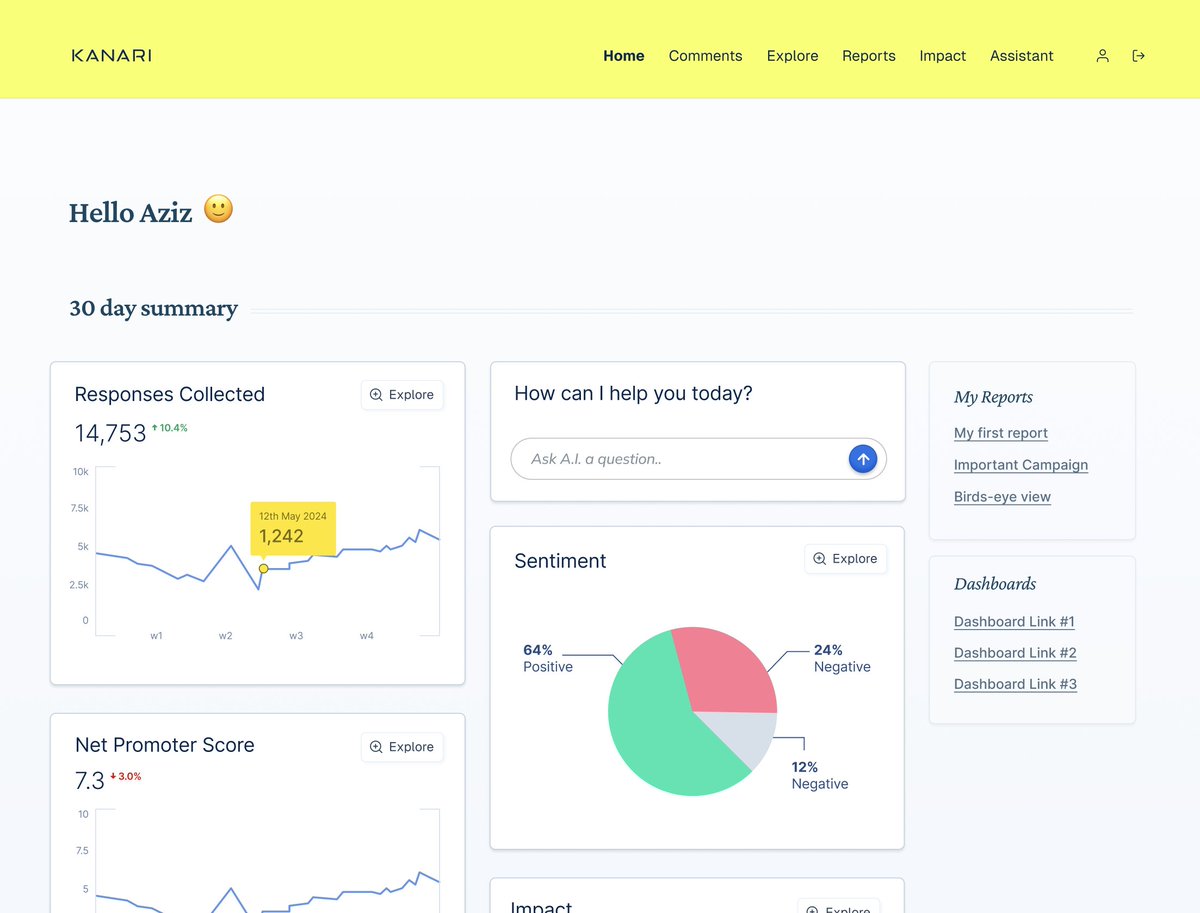
There's more aesthetic exploration around home screen widgets Playing with shadows, light, colors and hierarchy
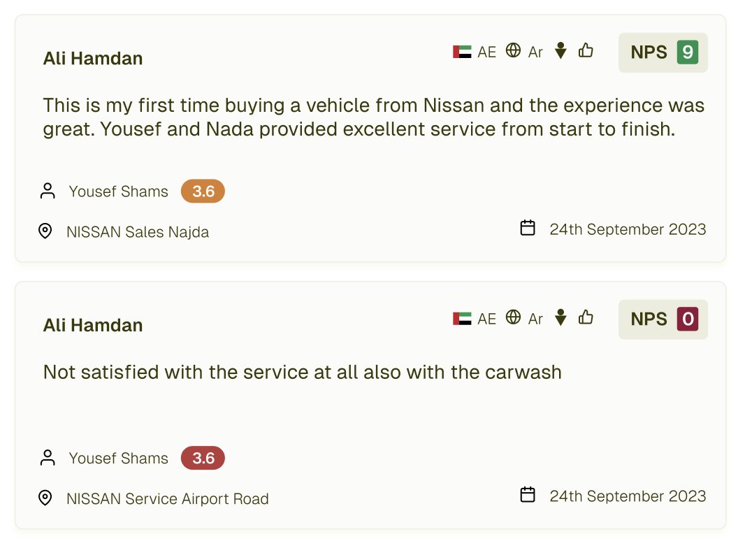
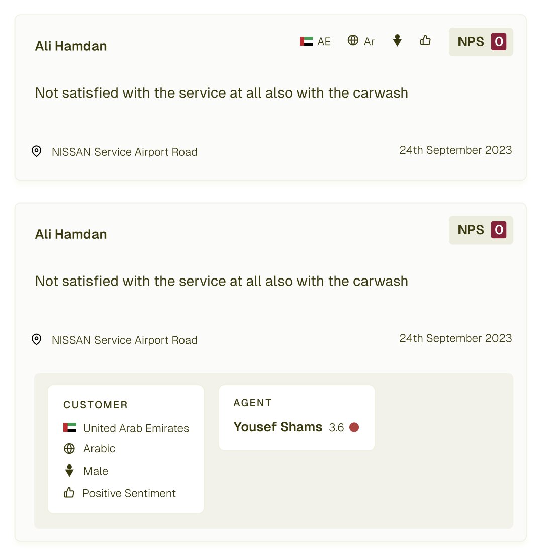
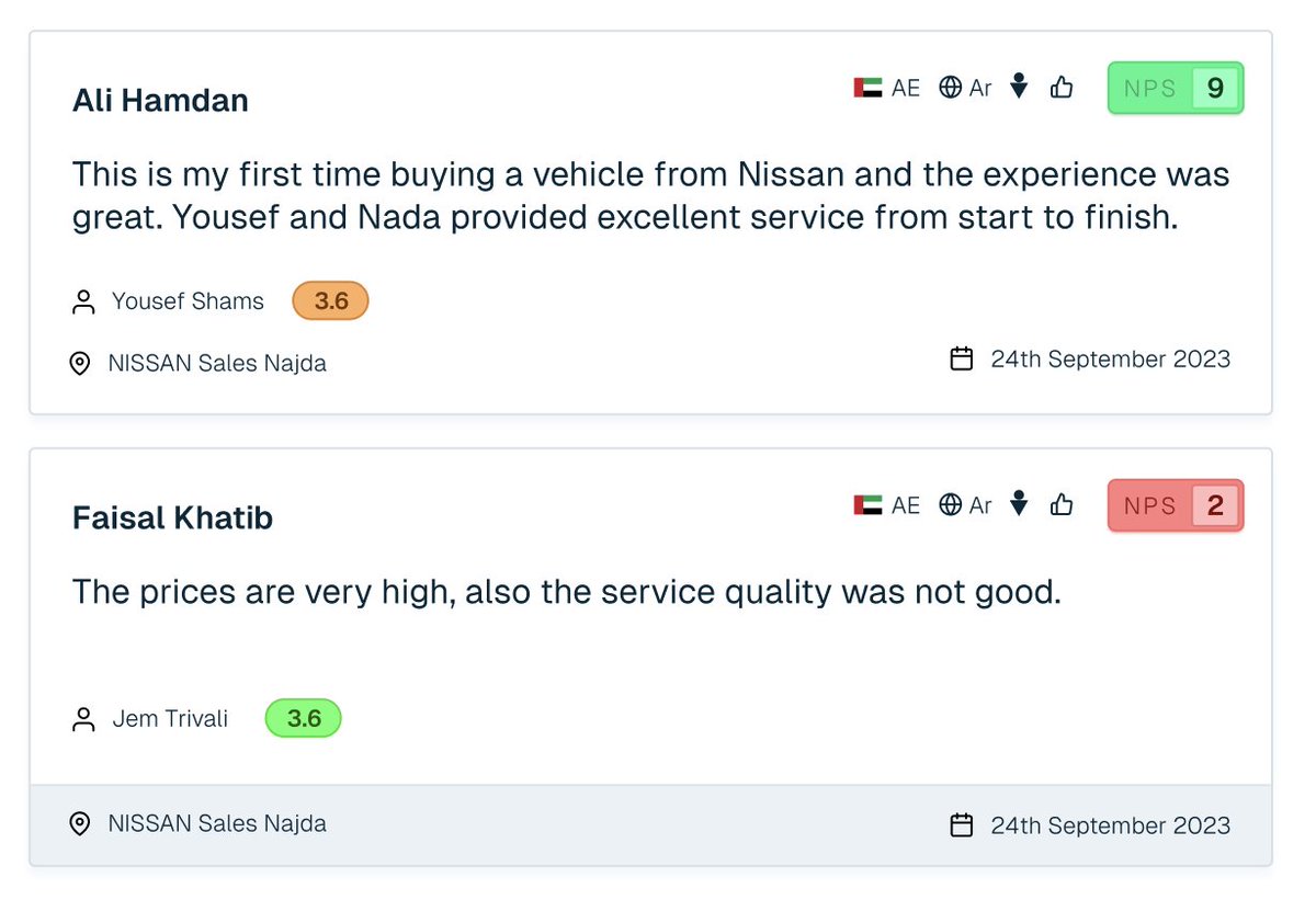
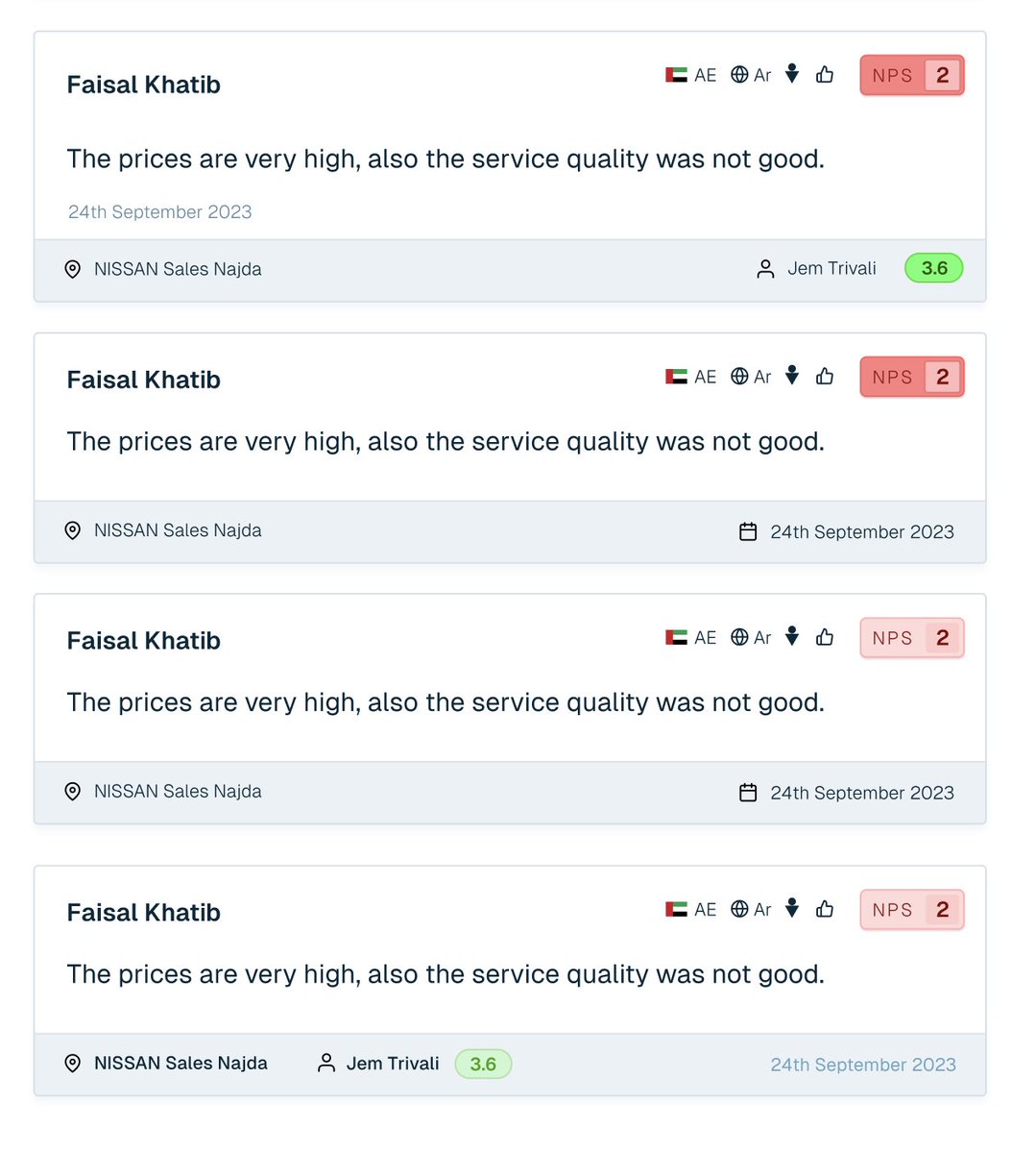
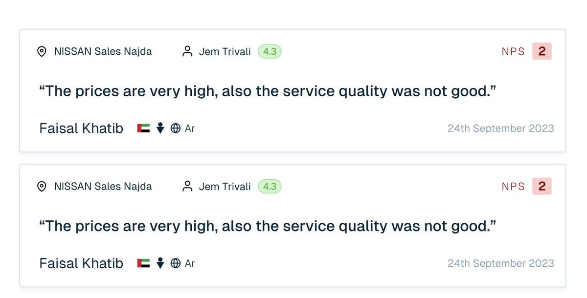
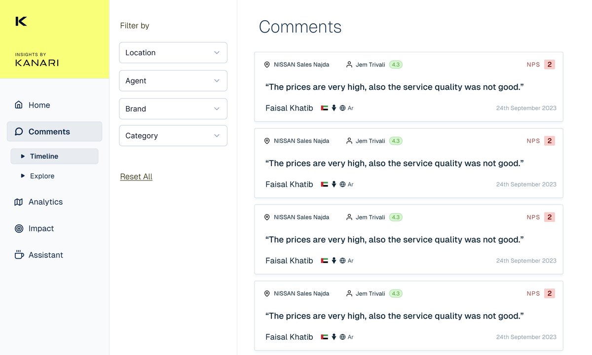
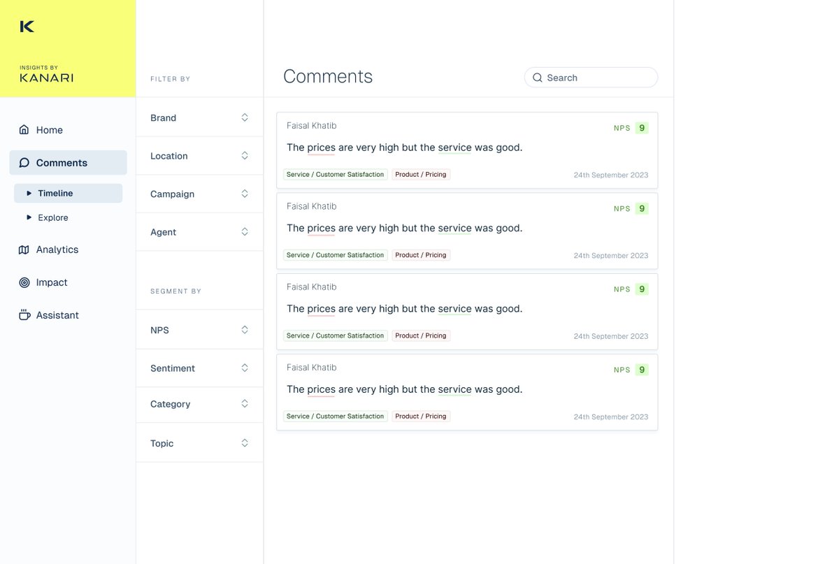
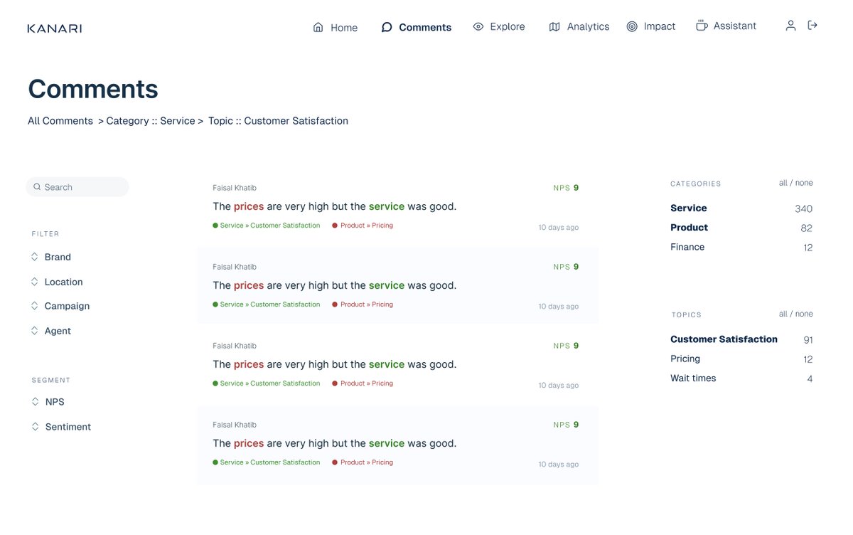
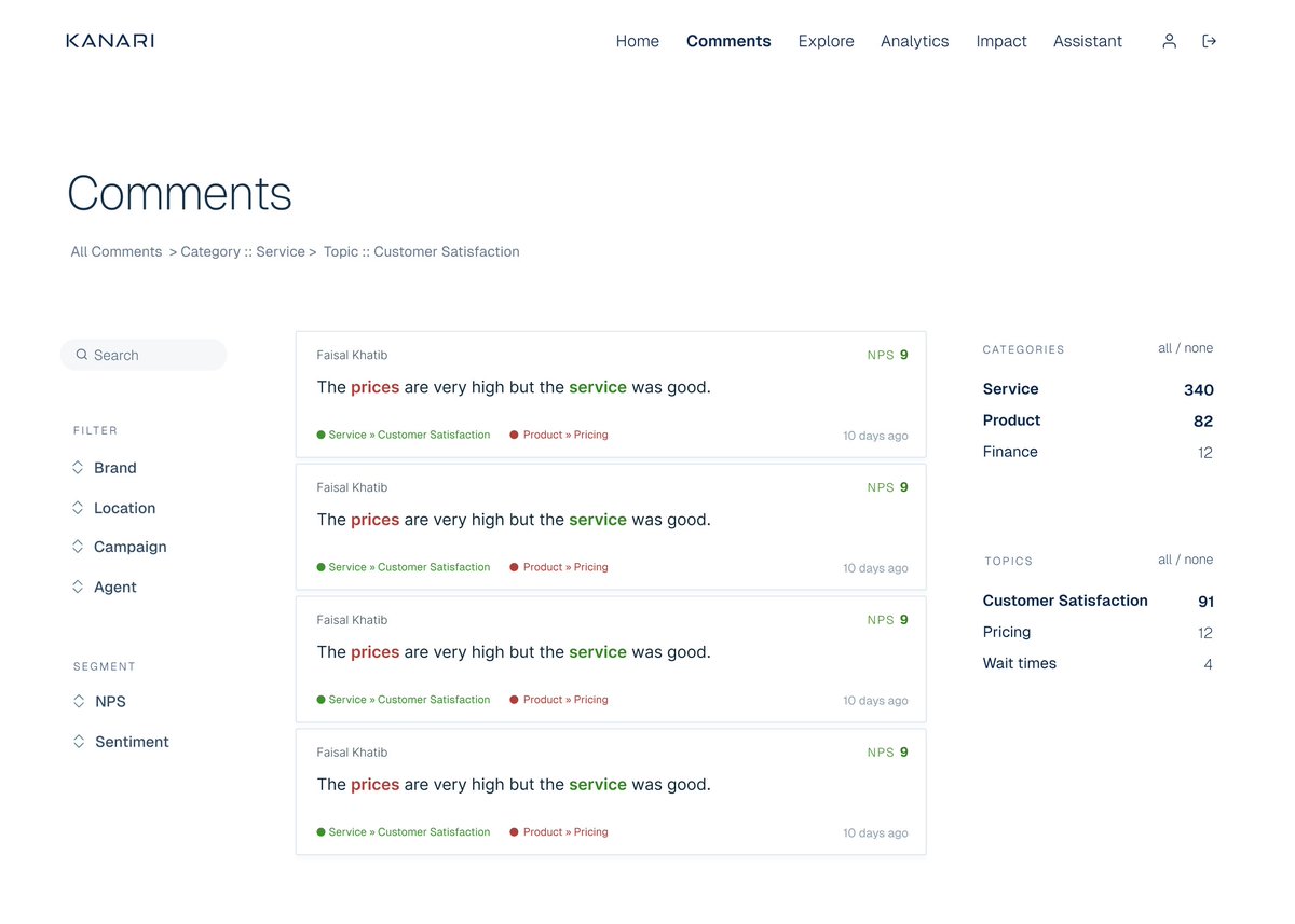
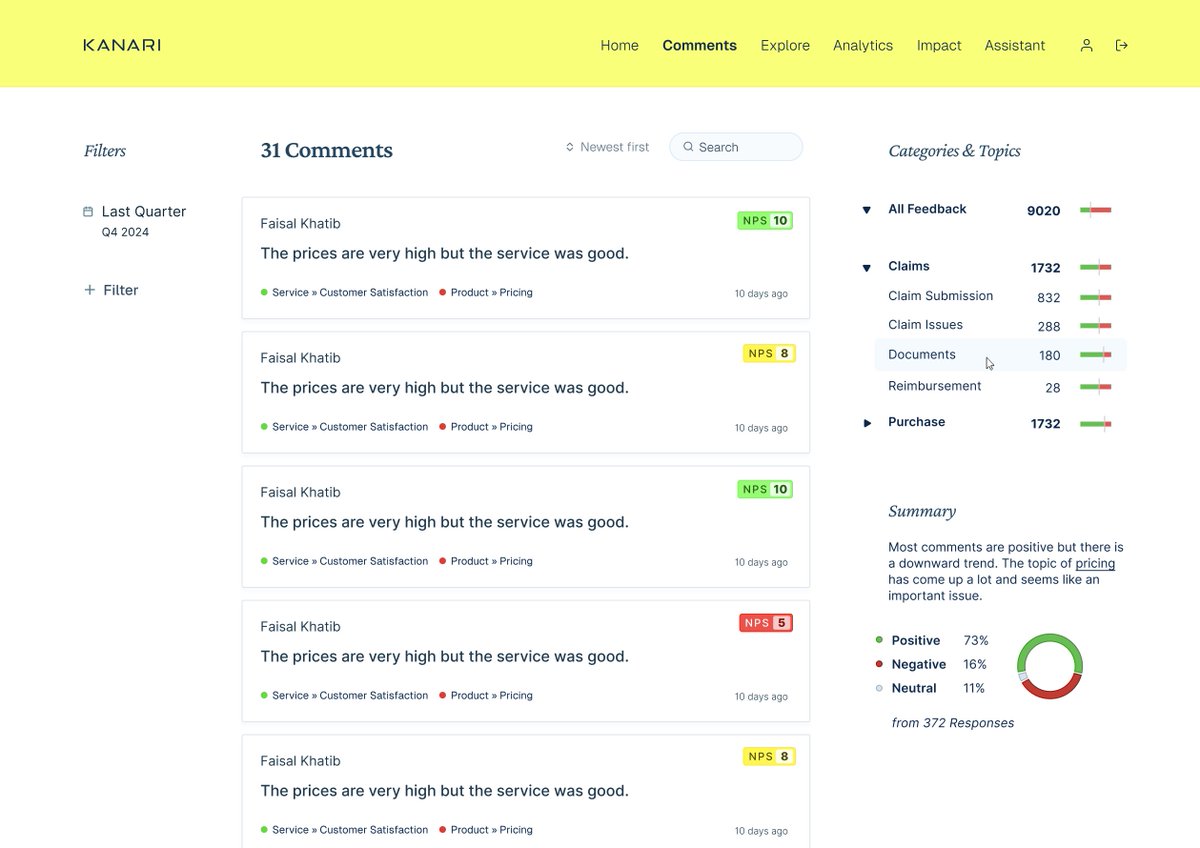
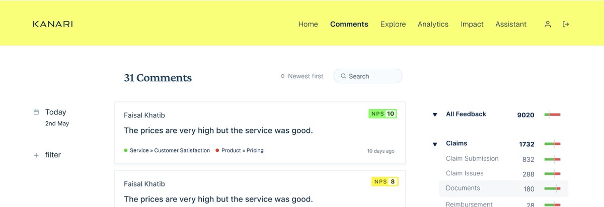
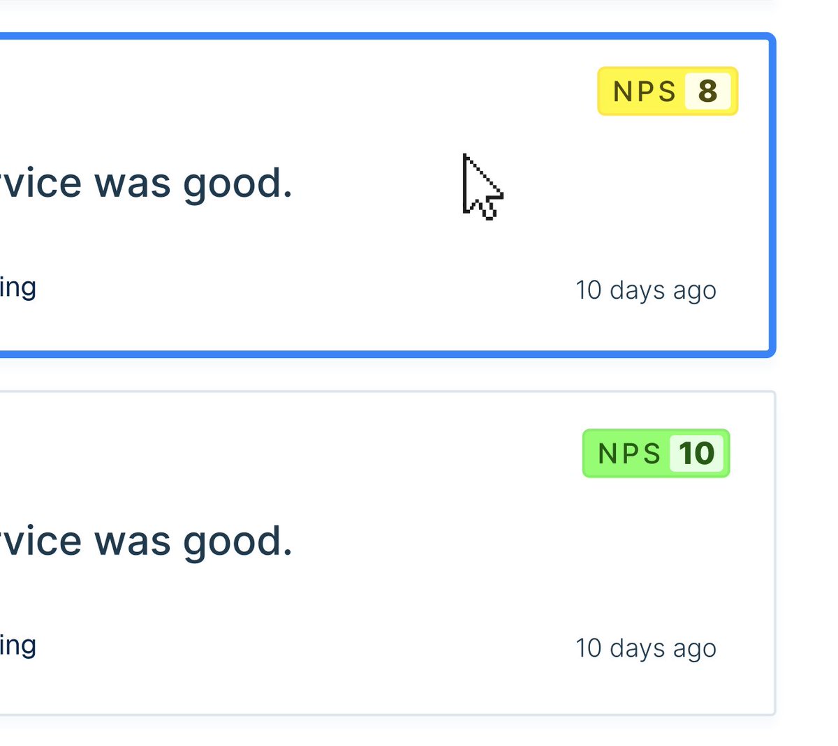
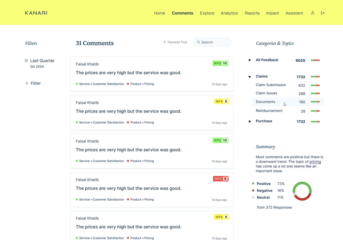
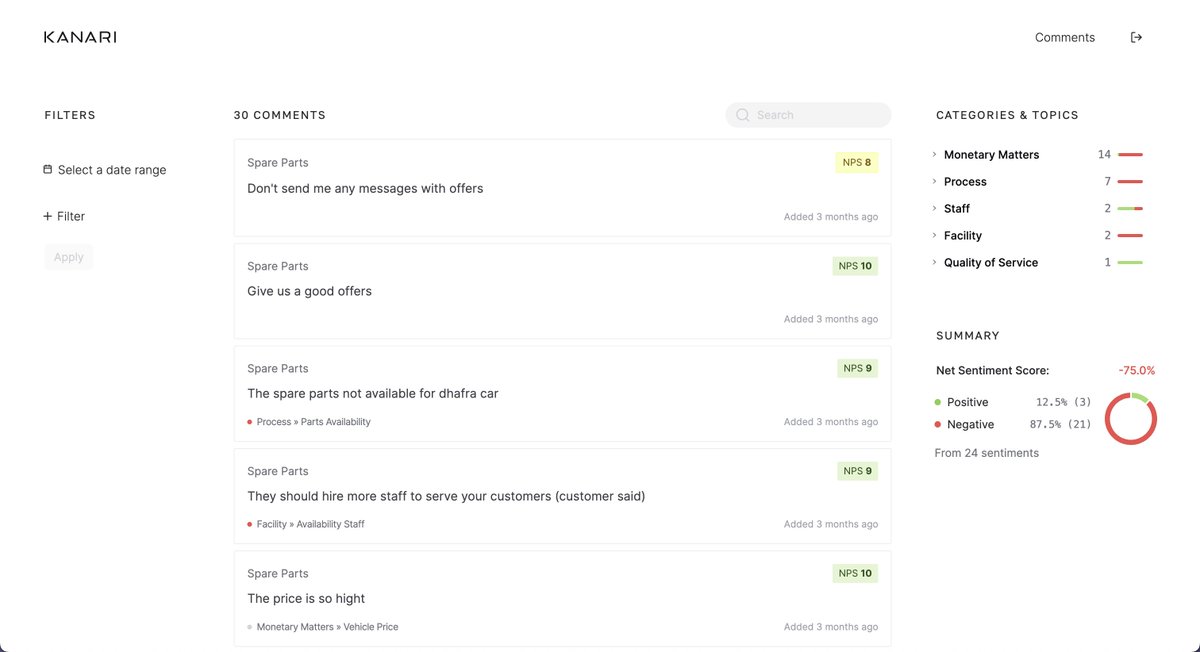
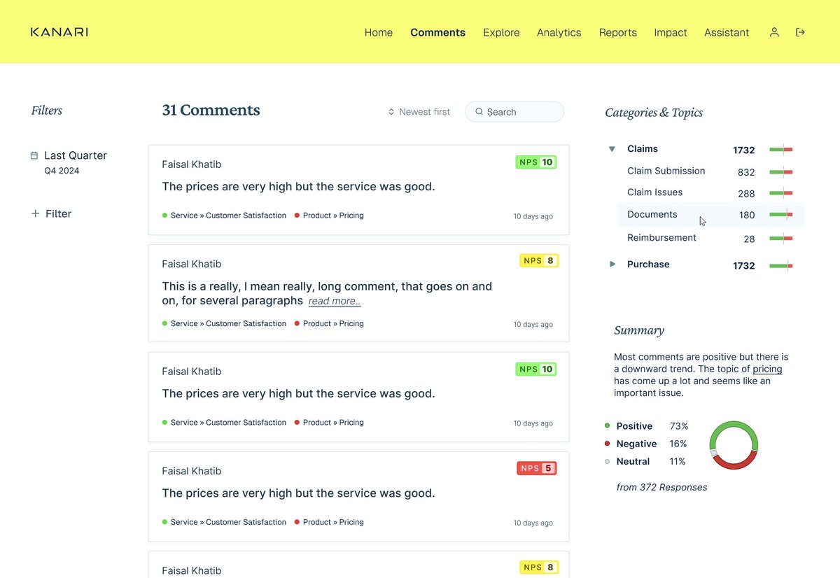
There are so many ways to layout the same component, but as I iterate through the different ways, I start to find the best iterations For comments, I've been playing with these ideas
Bringing it all together: - We sketched it all on paper - Experimented with layouts and colors - Iterated on components And now we're starting to play with something that looks a lot more like UI
There's a long way to go and there's a lot more to this build that is very exciting so please follow me to see how it turns out. I'm also looking to take on a project for May/June. I have a unique working style. I do 1 week sprints with each client ...
The sprint can be design sprint, during which we design high fidelity mockups for complex software projects Or a code sprint, where we build an MVP and attack a few important features to get ready for a quick launch!
I'm only charging $2,500/sprint (which will go up in time) Currently accepting projects for May/June Please DM me with a "hello" and a quick line about your project if you're interested.
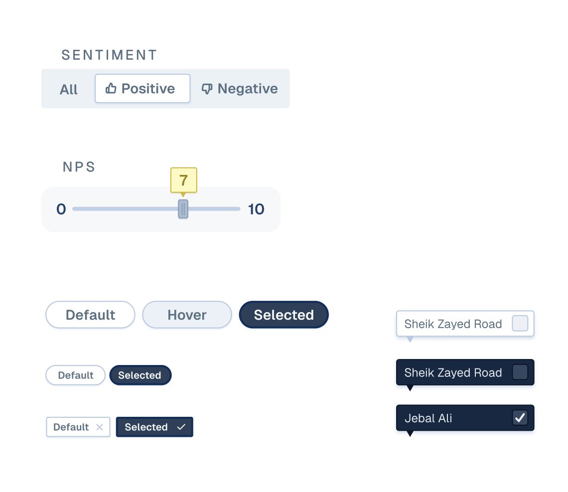
When you take designs from paper to Figma, you tend to jump around various "fidelity" levels. Even though, there is a lot of higher level problems to solve, I decided to work on some component details to help visualize flows better, but also get a head start on components.
More bits and pieces
We'll be using these bits to paint our user flows in high fidelity Then, we'll be able to iterate/search for the most optimal ways to solve the problems like: 1. The best way to filter data 2. Finding useful graphs/charts 3. Best way to organize everything
Design is like climbing a new mountain, not knowing the best path up, and having to backtrack several times before finding the optimal path. Code on the other hand is like climbing a path climbed many times before, but doing it in record time. They are two different sports.
This design project is for @subhif's Customer Experience Analytics company Kanari. They help companies measure CX over several customer touch points from sales to delivery and even after that.
The system they've designed is quite impressive already and this dashboard is going to be another layer to visualize all the data they collect.
I've been building a Dashboard for Kanari, which is Customer Analytics company based out of Dubai run by @subhif Every project I've done so far has thrown me a curve ball, this one was no different
What I did: - Dove straight into design work - Did minimal brainstorming What I should have done: - 2-3 intense days of brainstorming with the client going into every detail of the project - Then jump into design
We're getting there, but it took longer than I expected (which is completely fine) I'm happy to pay the price to learn how to structure projects better But this is why I like building in weekly sprints, you get to learn and improve every project, every week
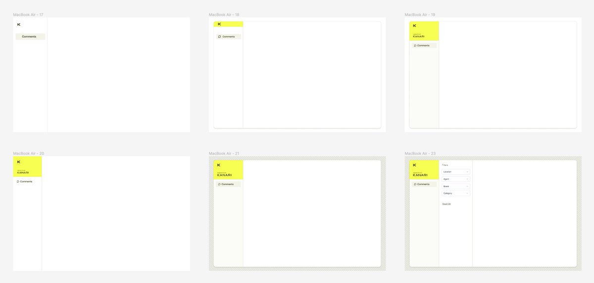
An update on the design front I wasn't loving the "boxy" direction I was headed in, and it also wasn't "on brief" as the client specifically asked for a simple/clean look.
So I decided to "break away" from those boxes and explore what the design would look like without a lot of the fluff ..and I really like this new direction I think it's simple, but much easier on the eyes and for a dashboard that you'll be using everyday, it's nicer IMO
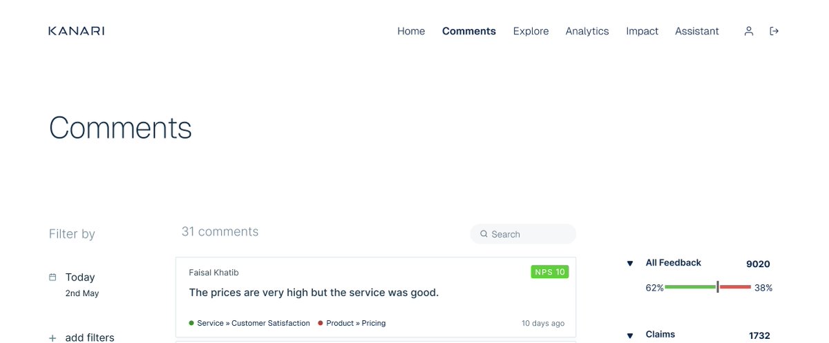
This "jump" from one aesthetic to the second one, happened in 1 frame in figma, so it's really hard to predict sometimes what direction you'll take as a designer The more your iterate, the more you discover new ways to present the same user interface
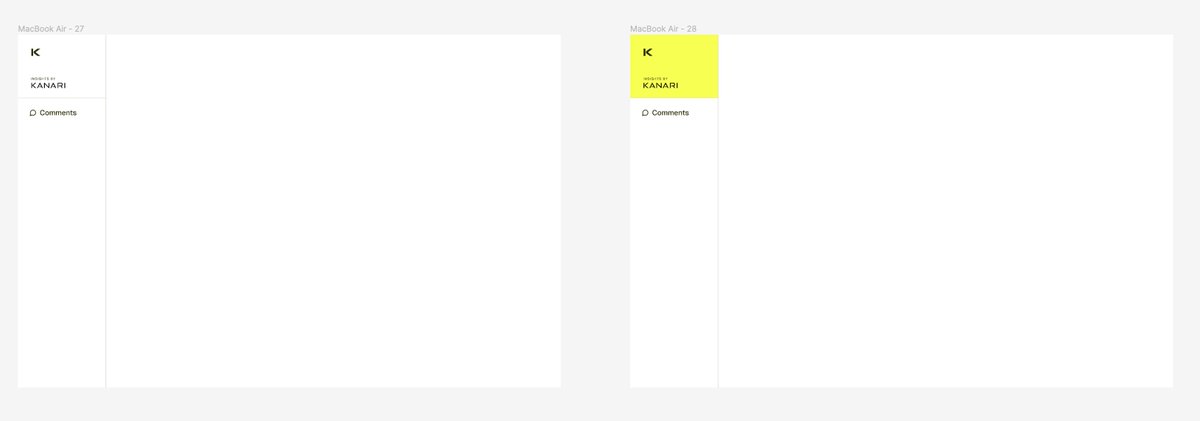
This one's even simpler still without the icons in the nav and a lighter header
There is so much data to understand/process, that even though I'm only really designing the dashboard, it became quite important for me to understand the various data structures at play
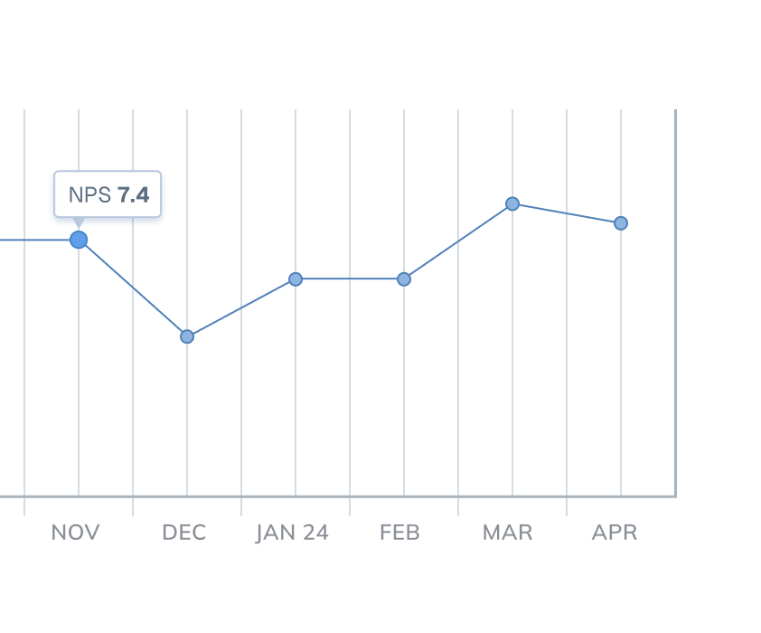
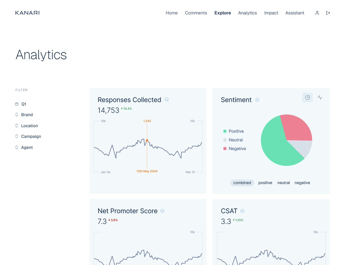
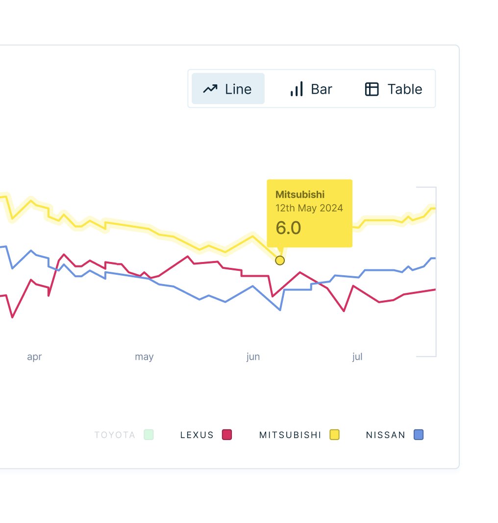
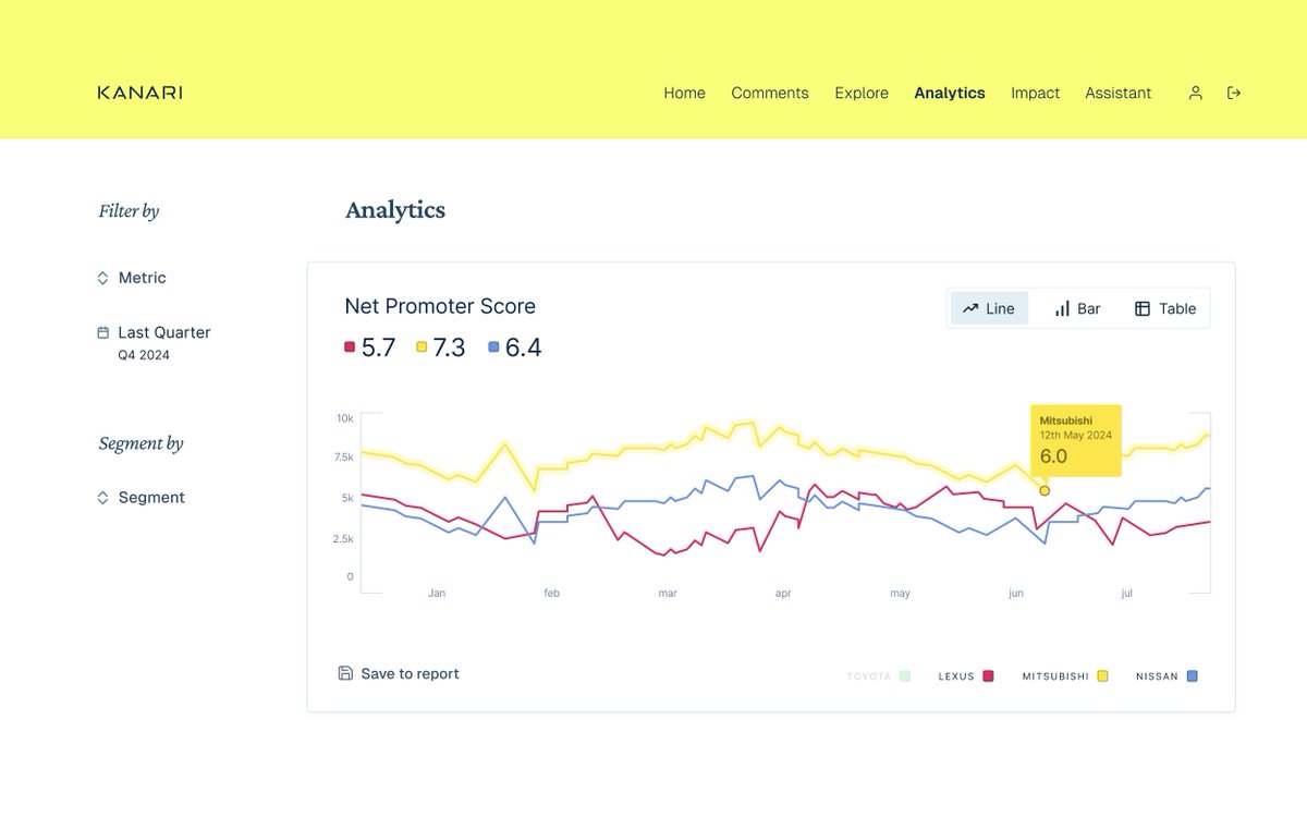
A cleaner analytics page with various chart types
I think this was the closest I was to liking the direction. After having a chat with the client, we figured out which parts to keep and what to discard. The next iteration should be a lot closer to a production ready version!
An update on the designs for Kanari, which is a Customer Analytics firm out of Dubai run by @subhif I've come to appreciate just how deep their data analytics goes (even beyond what this dash will capture) so if you need CX insights, send them a 👋 What it's looking like now:
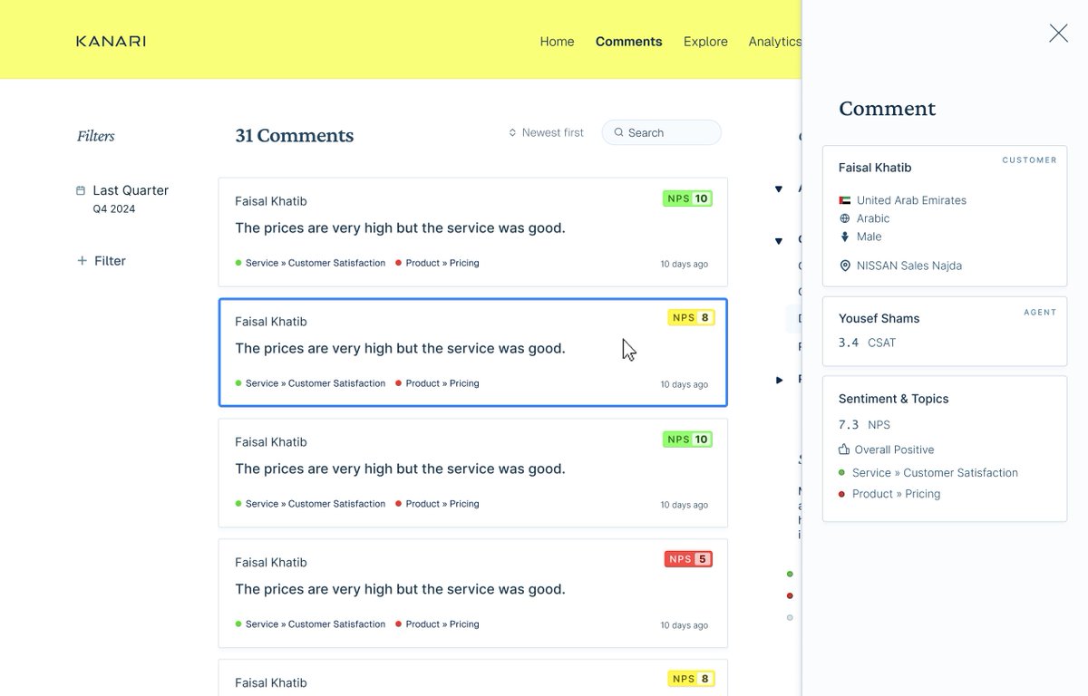
An overlay pattern that will come in handy
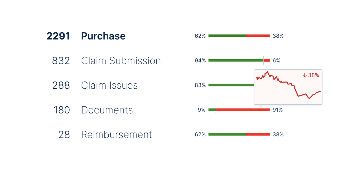
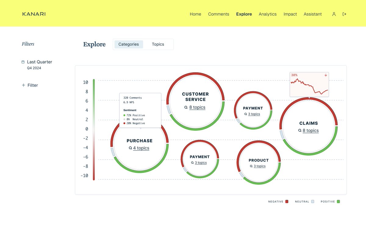
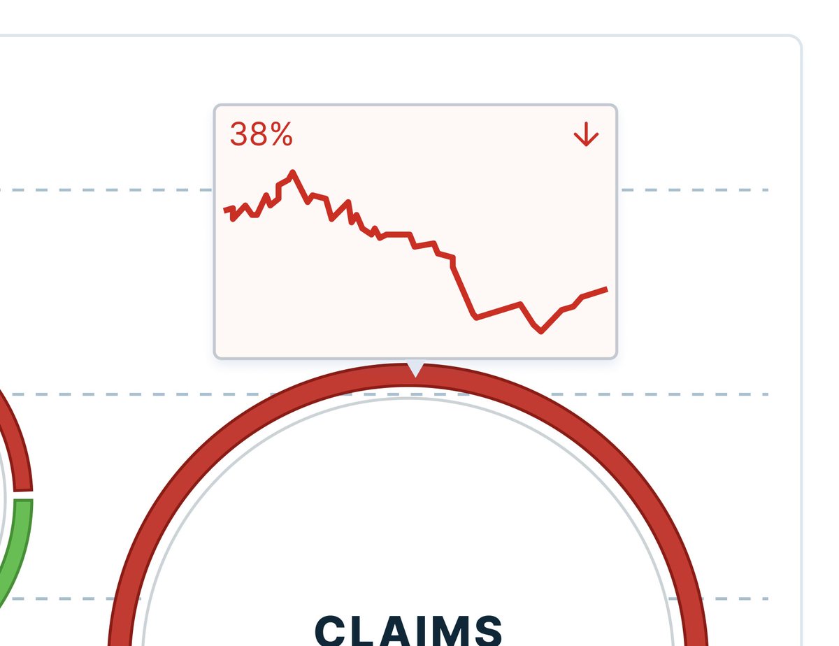
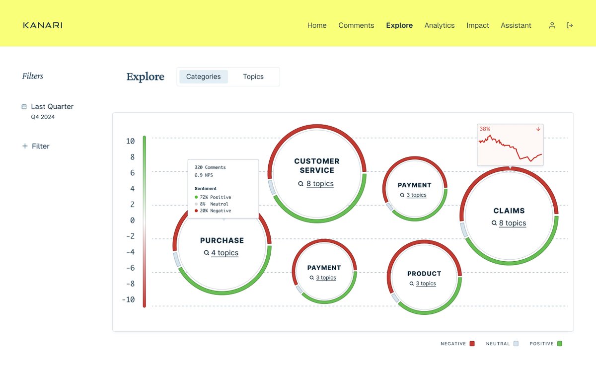
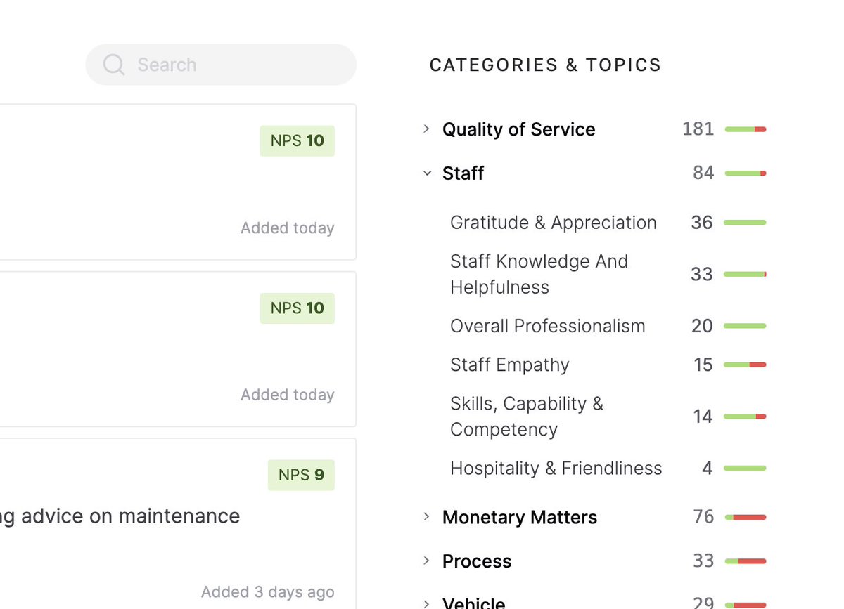
A way to visualize how categories are doing
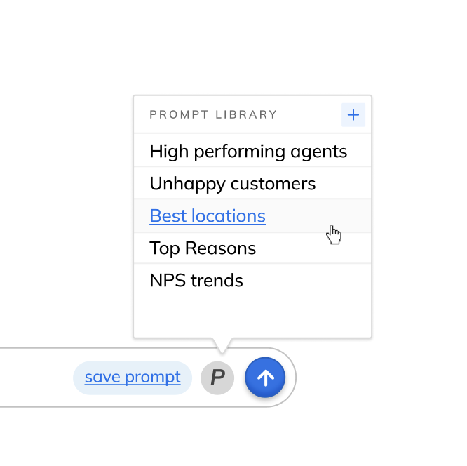
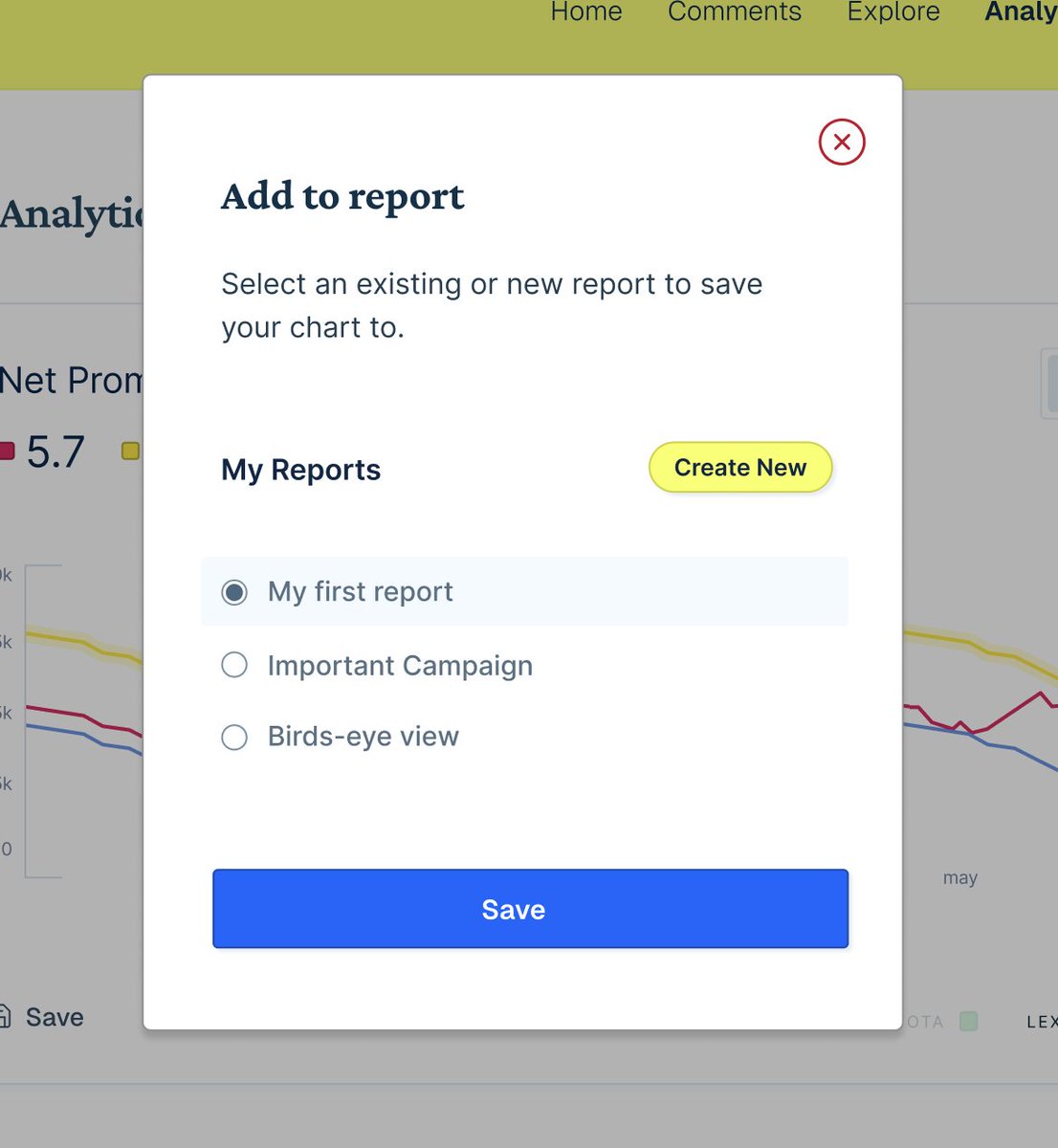
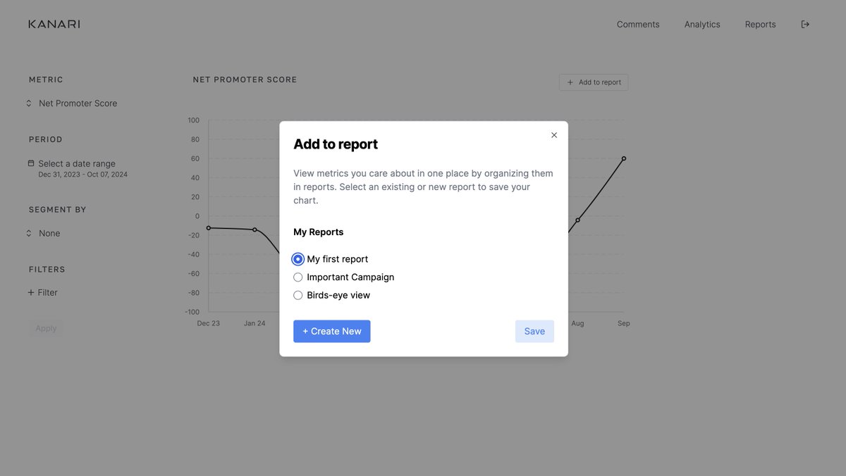
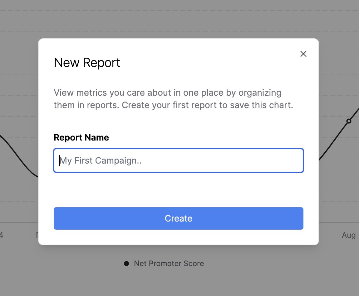
A way to create reports, still working through the flows on this one
Was a bit torn between header types, which do you like better, A or B? Please share why in the replies 👇
Working on detailzz...
Quite happy with how this project turned out! I'll probably tweak a few things after going through everything with the client. But wanted to show you all what it looks like. This is a CX analytics dashboard for @subhif's Dubai based CX consulting firm @KanariCX #buildinpublic
I'll take a few days to rest and then take on my next project. If you need design help on a larger project like this or want to quickly launch an MVP, DM me for a free quote.
The last few weeks I've been helping the Kanari team build out their Customer Analytics dashboard (feat @subhif) The backend is in Ruby on Rails and the frontend is built out in React & ShadCn. There were 3 main challenges getting this one to work right:
1. Getting React/Shadcn to work with Ruby on Rails It's possible, clearly, as it's done here, but it was a struggle. You're plumbing together two alien worlds together and getting them to play nice. But once it works, it's React as usual.
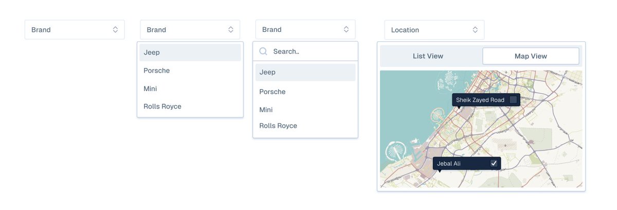
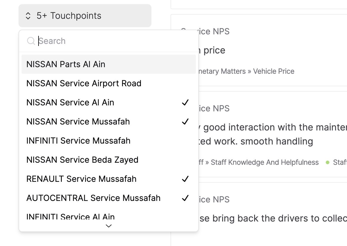
2. Multi select dropdowns are hard! This innocent looking dropdown has so many failure points. Like scrolling, search, updating labels to make sure you know what's selected, clearing the search bar when closed, or resetting the filtered results when opened.. It's a minefield!
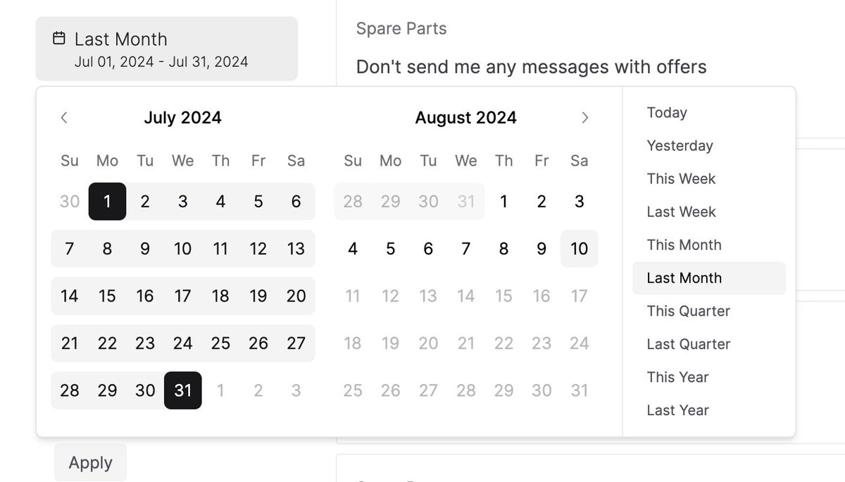
Even calendar dropdowns can be quite tricky to get right! They are just so fragile with all the moving parts that the probability of facing obscure bugs becomes quite high. I for example spent a day on getting the dates to highlight correctly (The CSS cascade had a bug)
3. Getting the UI to look fiiiiinnnee Now this part I absolutely love and can do all day. Getting the grid lined up, paddings, margins, font weights, sizes, colors, kerning, icons to all work together in visual harmony is what I'm best at. I could do this in my sleep.
That's a wrap on this update!
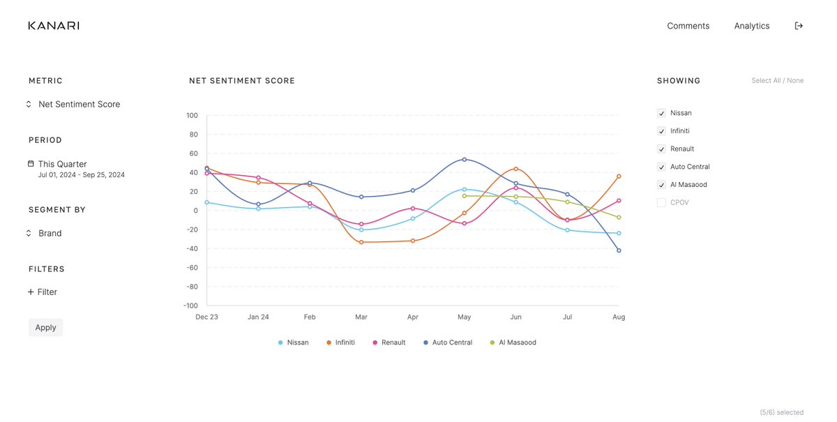
The Kanari dashboard is looking slick! We just added a whole new Analytics section for enterprise clients. They can now map metrics, select a date range, filter them and segment them. It's been a long time coming, this was a ton of work for the team & I'm stoked with it.
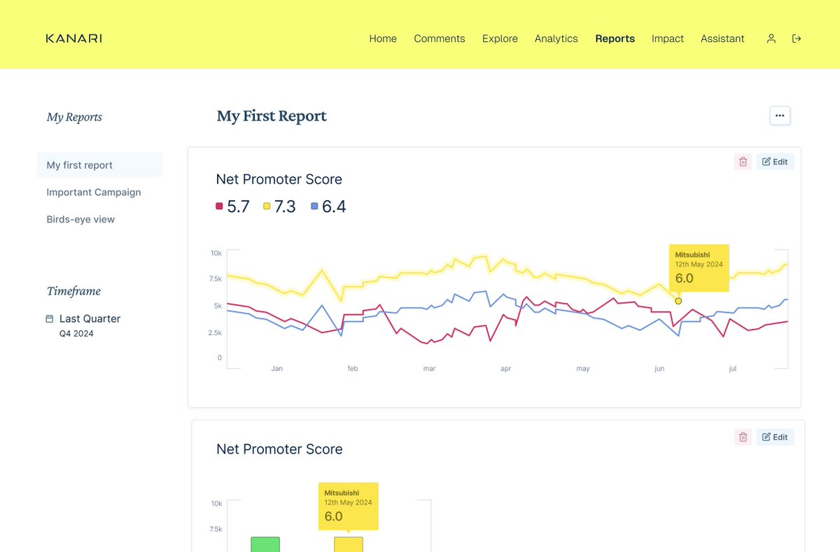
Working on 'Saving Reports' for Kanari Analytics I love how this project is evolving, becoming more powerful; pulling in giga-tons of feedback and charting it for the business. If you operate in the UAE, DM @subhif. Seriously, the data stack they're running is one of one.
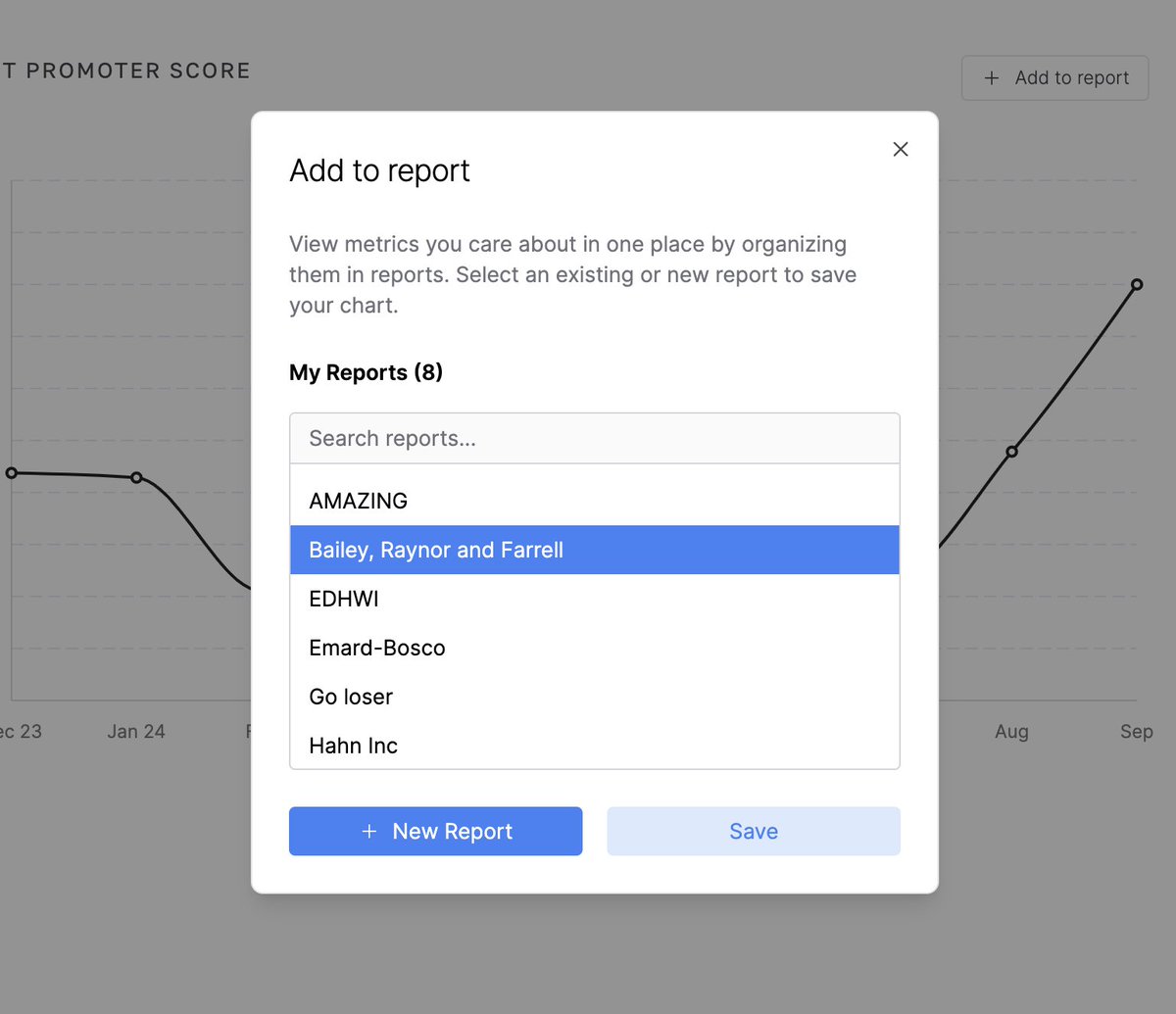
Added search, scroll for longer lists, better type sizing, and visual balance
The Reports section on Kanari is starting to look fiiiineee 👌 Can't wait for @subhif to start onboarding clients to this
What a year it's been. I built all this in 12 months 👇 (Kanari made the cut — pulled from the year-in-review reel)
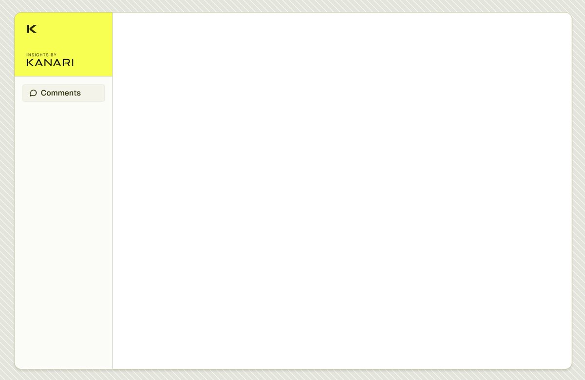
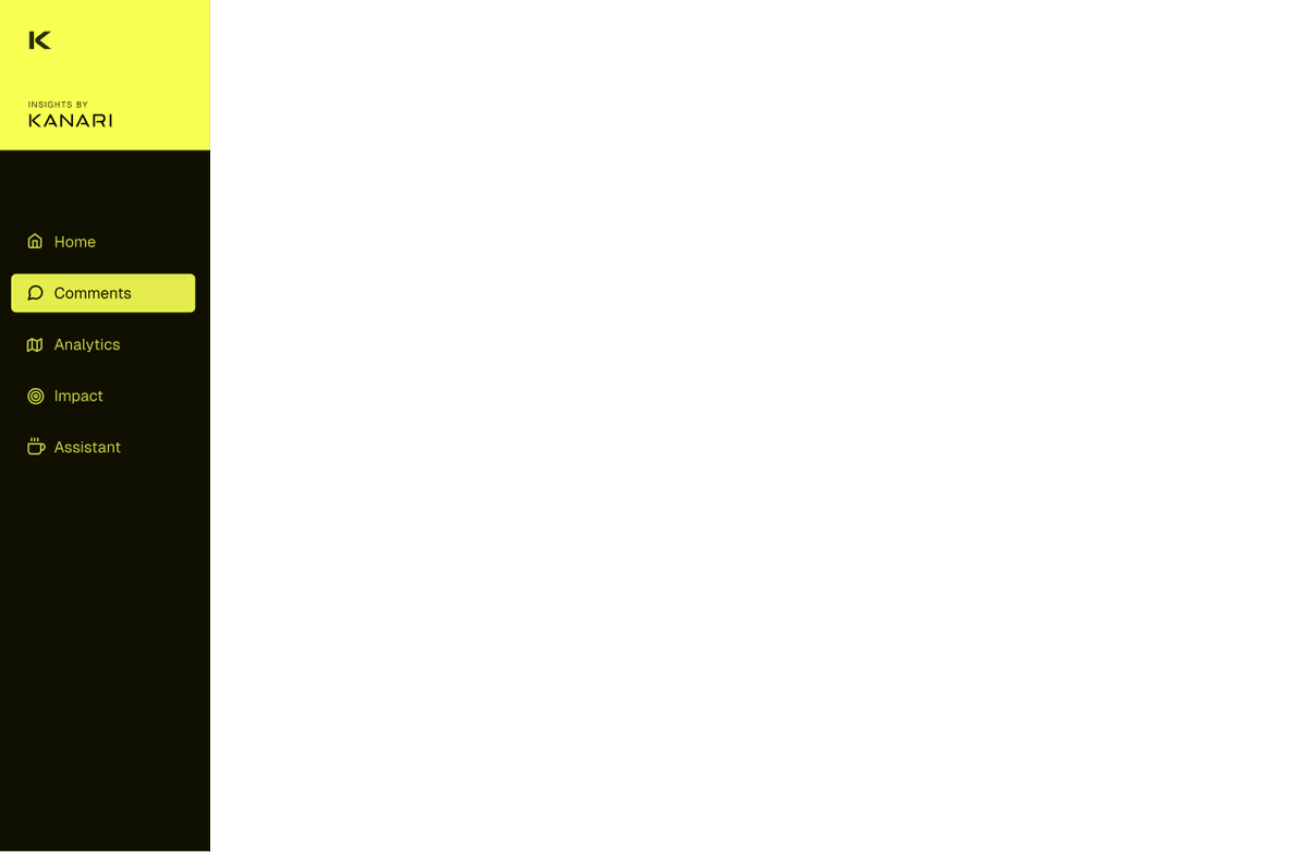
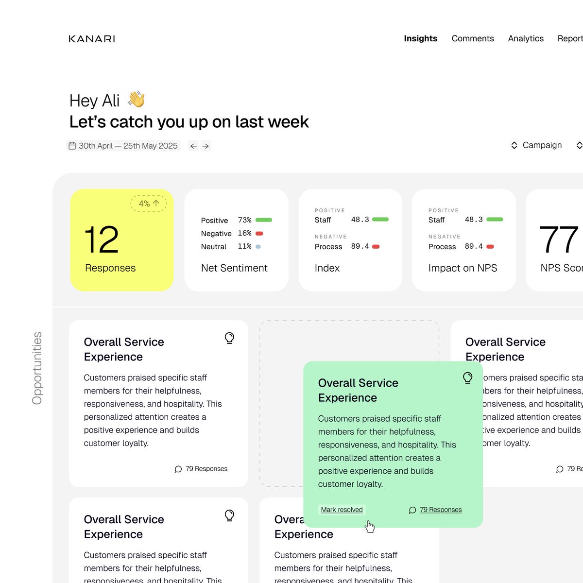
Really love a pop of yellow on a page
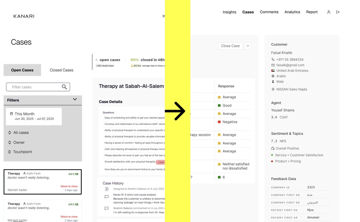
An update on the Kanari Case Management redesign I sat down with the client and spent 4 hours wireframing the vision for what the updated app flows will look like I'm already super excited to be working on this (If you don't know what I'm talking about, check my post history)
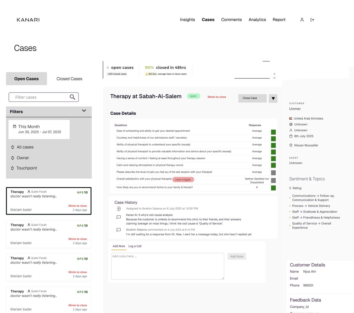
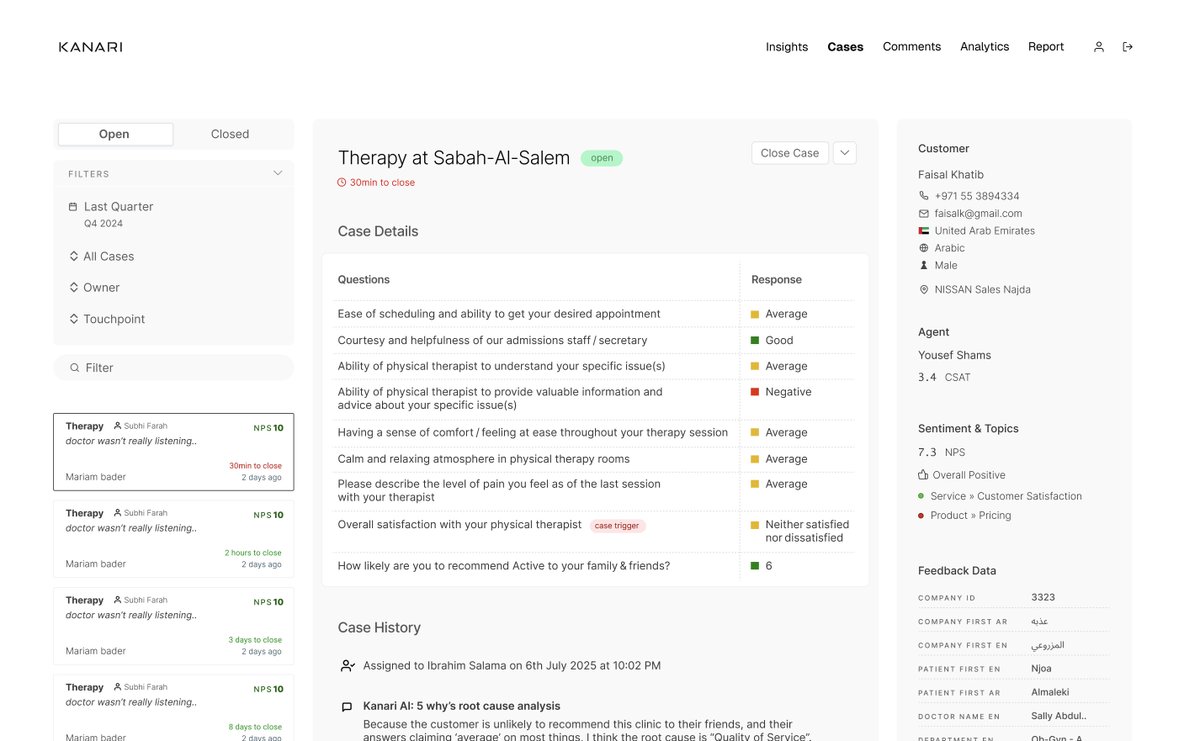
Here we have the case management dashboard you can see cases on the left with some filters in the center pane you have the case details and history and to the right you've got customer info
as you can tell it's UGGGLLLYYY! but that's okay we're trying to understand where we're going it's the design equivalent of pointing somewhere to show where that building is it's vague, but to me, it's a roadmap
and we didnt' magically "get here" either we had to start with just the current state of the app and bring in elements into our wire frame talk through each one and nudge it closer to where we want it to be
I love designing complex apps like this Btw, let me tell you about Kanari .co It's an incredibly powerful customer analytics platform hospitals, auto dealerships, dentists all use Kanari to get feedback from customers you can run surveys, track NPS scores, and best of all
understand WHY your customers are churning why didn't they return to your dealership to buy another car? a survey at the point of sale shows this and then an agent can follow up for more information branch owners can assess activity to identify what works it's crazy powerful
So yeah, that's my update on the wireframes Next up, I'm gonna have to actually redesign this thing I'll be sharing everything here, so follow and RT this so I know you enjoyed this and want to see the next update
Wireframe -> Low fidelity Step 2 in any design process is going from UGLY wireframes to LESS UGLY low fidelity mockups Low fidelity is a bit like a middle ground between having really vague and rough wireframes, and high fidelity where every pixel has been fine tuned
Because we put in all the ground work with our client (Kanari) We have an amazing starting point for low fidelity designs Like seriously, this is the moment I'm so thankful for the wireframes, because without it I'd be aimless and frustrated finding some direction
After just a round of cleaning up our wireframe and applying our existing design language to it, we have something I'd call "low fidelity" It's starting to look like a version you could build and launch, but that's an illusion at this point
If you look beyond the superficial layer, we still need to: - reconsider every item on the page - how it works with everything else - and find the best way to visualize it that's kinda the hard part, but also where most of the gains are it's where we get to "delight the user"