
PIXELS ON GRIDS

← CASE STUDY / WEALTH AWESOME

Wealth Awesome

Wealth Awesome is a data-backed personal finance resource for Canadians, run by Qayyum Rajan, CFA, getting 50k+ uniques a month.

This is the full design-in-public archive from May 2025 — moodboarding, the Swiss-inspired brand direction, the mountain logo redesign, color and palette iteration, the detail page, the footer, and the stock summary page.

Kumail
Kumail @kumailht · May 3, 2025

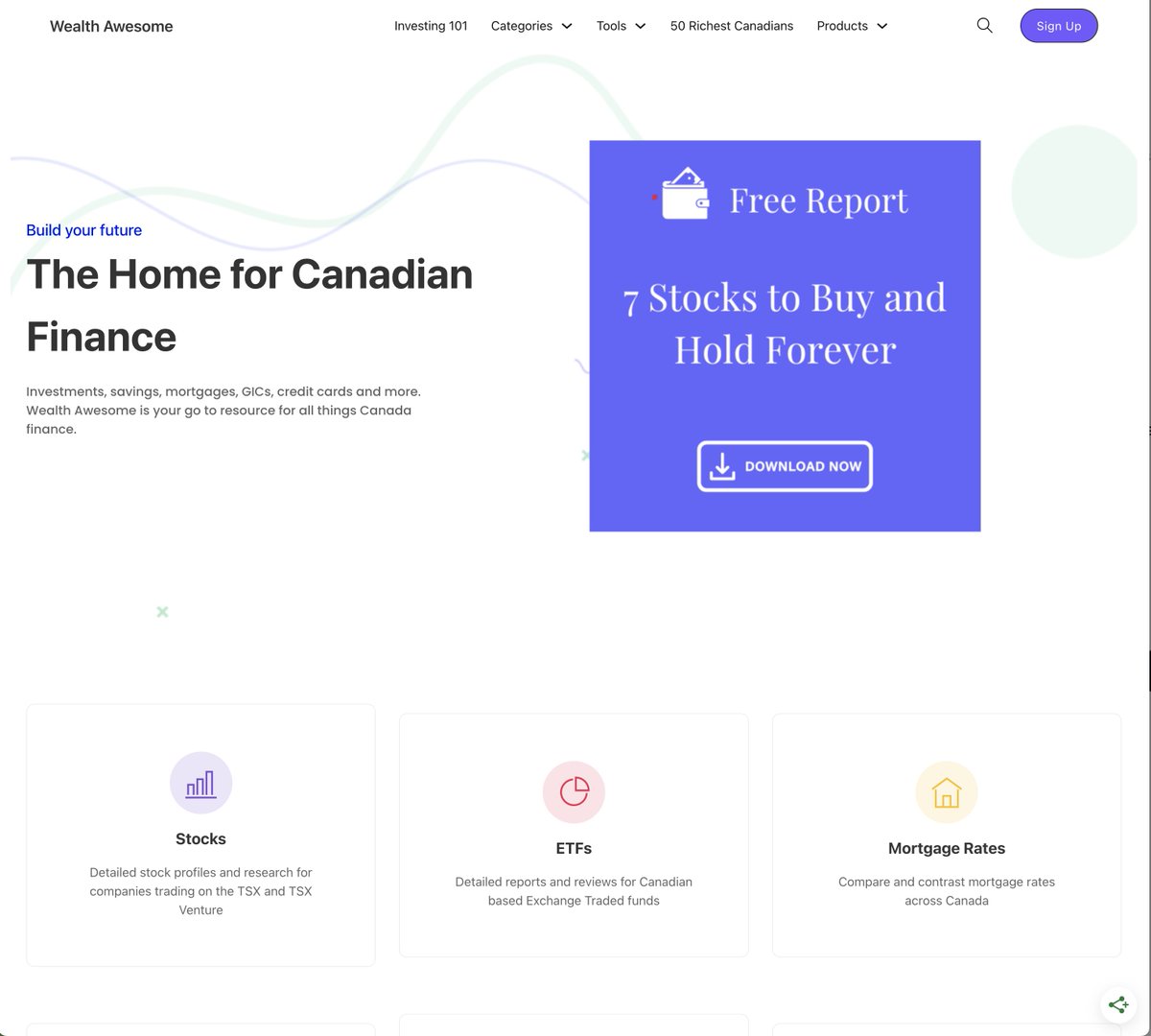
So excited to be working with @qayyumrajan again, this time redesigning @WealthAwesome . Wealth Awesome is a data-backed resource for Canadians to grow their wealth. It gets 50k+ users a month and it's time it gets a facelift. This is what the current website looks like!
Wealth Awesome build update
Kumail
Kumail @kumailht · May 3, 2025

It's kinda bland, but does the job. We're gonna be taking it a level up. If you wanna see how this turns out, follow me! And if you're interested in taking your website up another level, hit me up in the DMs!
Kumail
Kumail @kumailht · May 3, 2025

@qayyumrajan @WealthAwesome You bet!

Kumail
Kumail @kumailht · May 7, 2025

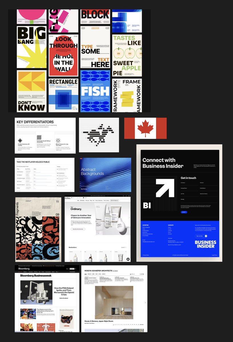
An update on the @WealthAwesome design project: After a kickoff with a design client, the first thing I do is set the tone for the project This is usually very high level A few notes on design direction and a mood board This is the mood board I did for WealthAwesome

Wealth Awesome build update
Kumail
Kumail @kumailht · May 7, 2025

I usually start with notes on the project to understand what the business model is and what the overall goals are For WealthAwesome, a website that gets 50k+ uniques, targeting Canadians on their financial journey, I knew there were certain themes that will be important

Kumail
Kumail @kumailht · May 7, 2025

Their business model will heavily rely on Ads, Affiliates and Subscriptions. And the website is a data + editorial mix that helps everyday investors find the best credit cards, mortgages, loans, stocks, etfs, etc Used by mostly 25-54 year olds, which seems about right.

Kumail
Kumail @kumailht · May 7, 2025

We knew we want to be serious, but not like Bloomberg or Financial Times serious. A bit relaxed, but not Milk Road relaxed. The crypto scene I'd wager attracts a younger audience. So we're going for a friendly tone, but also trustworthy and intelligent. ie. "brand voice".

Kumail
Kumail @kumailht · May 7, 2025

Immediately, I'm thinking: - Swiss Design - Red on gray - Large bold sans-serif - Vertical grid lines - Large-ish Serif body copy - Canadian symbolism - Trees, mountains, forrest, snow - Graphite, blue, lines, grid

Kumail
Kumail @kumailht · May 7, 2025

Now we've got a bit of a starting point Those words, are already painting a picture in my head But we can't ship my imagination now can we? It's time to roll into Figma and see if my ideas can be turned into a design direction!

Kumail
Kumail @kumailht · May 7, 2025

Stay tuned if you wanna see what the design direction turns out! I'm taking on more design projects in April, DM me if you like my work and process!

Kumail
Kumail @kumailht · May 7, 2025

@tholder @WealthAwesome Plenty of brands use red successfully — like SwissAir, ScotiaBank, Canada CIC, HSBC, UBS, etc But I think you're right in that red is a more challenging color to use for this use case.

Kumail
Kumail @kumailht · May 7, 2025

@tholder @WealthAwesome Haha fair, the Swiss def own red, but I'd say Canada kinda owns a little red too. And this client's focus is 100% Canadian finance.

Kumail
Kumail @kumailht · May 13, 2025

I'm redesigning @WealthAwesome for @qayyumrajan And I'm sharing the design process! We finished moodboarding in our last step, now we're thinking about colors and fonts The keywords we're thing about are: Finance, Canada, Friendly, Corporate, Authoritative

Wealth Awesome build update
Kumail
Kumail @kumailht · May 13, 2025

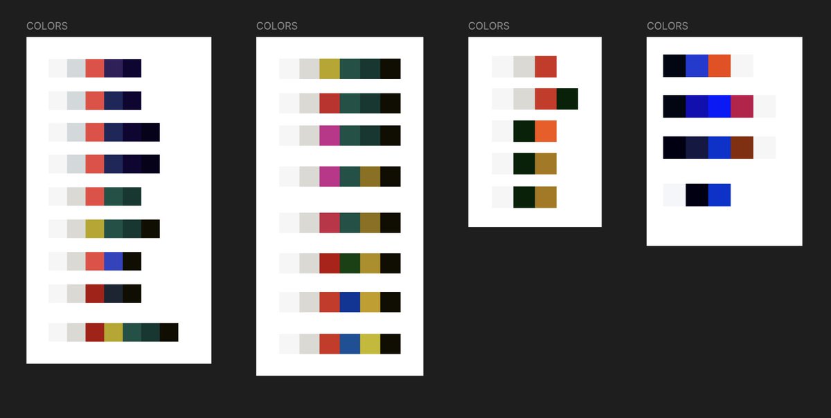
I spent some type picking colors that I thought would work well together. We may or may not use them, but with bespoke projects like this, we're trying to stand out, and it helps to think from first principles about the basics like colors, grids and typography

Kumail
Kumail @kumailht · May 13, 2025

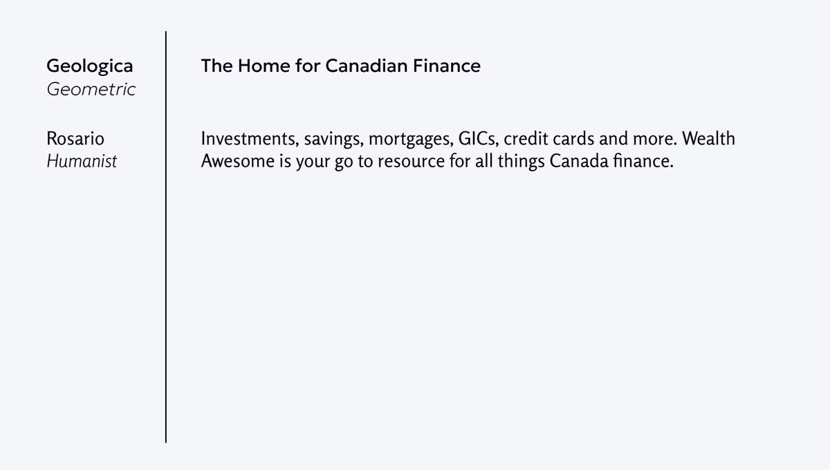
For the fonts, I wanted a Geometric font for the Headings and a very readable, approachable Humanist style font for the body copy. Here is a paring I really liked, Geologica and Rosario. I realize the letter width is a bit wider on Geologica than on Rosario but it still worked

Wealth Awesome build update
Kumail
Kumail @kumailht · May 13, 2025

What the hell is a Humanist font anyways? Well, imagine letters that feel like they were written by a pen—warm, approachable, and super‑legible on screens. If Geometric is a ruler‑straight grid, Humanist is a handwritten note from a friend.

Kumail
Kumail @kumailht · May 13, 2025

That's all for today, tomorrow we'll tackle the logo!

Kumail
Kumail @kumailht · May 14, 2025

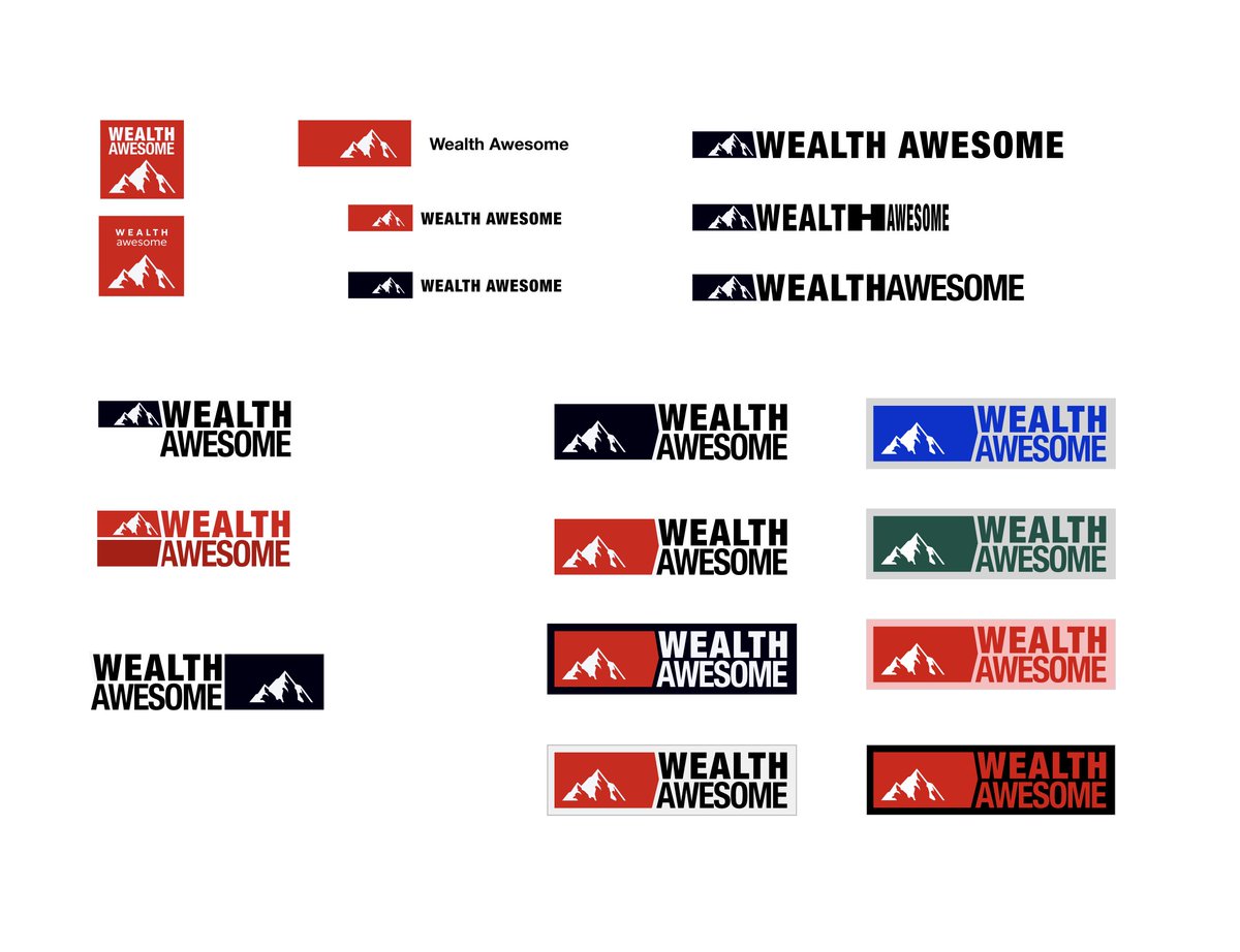
Next on @WealthAwesome we're redesigning the logo. I'm not a logo designer by any means, but as you can see the logo on the left (current) is pretty poor and we can probably do a little better. After thinking about some symbols we could use, I quickly settled on a "mountain"..

Wealth Awesome build update
Kumail
Kumail @kumailht · May 14, 2025

A mountain as a symbol works quite well. WealthAwesome helps Canadians with their personal finances. Vancouver, where I'm designing this for instance, is surrounded by mountains, is very inspirational. But also, climbing a mountain feels like an apt metaphor for this product.

Kumail
Kumail @kumailht · May 14, 2025

Whats funny is that, after all the experimenting and trying out various combos, the one I liked the most was an iteration of something I started out with. The top left one. I think the logo works really well for this use case and I'll share how I ended up using it tomorrow!

Wealth Awesome build update
Kumail
Kumail @kumailht · May 14, 2025

This is the one we eventually went with. I'll share how we end up using this in the design tomorrow!

Wealth Awesome build update
Kumail
Kumail @kumailht · May 16, 2025

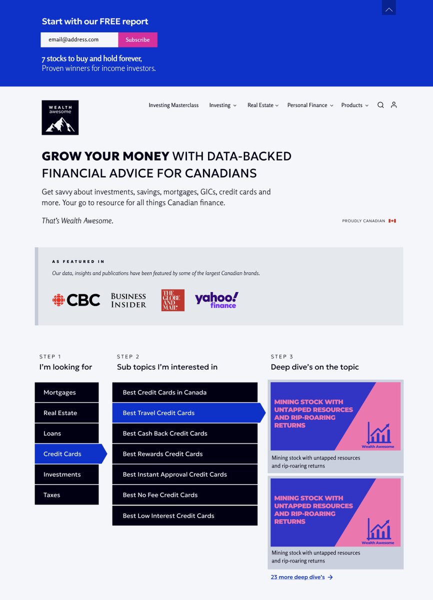
The first iteration for @WealthAwesome I wanted to try one of the bolder palettes with our logo. This is a bold blueish-purple with colder grays for the featured logos. I quite like this but..

Wealth Awesome build update
Kumail
Kumail @kumailht · May 16, 2025

I'm really liking it, but, as a designer I feel like I have more in the tank, like this isn't the most optimal design I can come up with. So we're gonna give it another iteration and where we can take this!

Kumail
Kumail @kumailht · May 16, 2025

This is the ugly truth of the design process, you just have to keep on iterating until you find a version you like. And have faith that you'll get there, even when you are not there yet and have clue if you'll ever get to a version you'll love.

Kumail
Kumail @kumailht · May 19, 2025

This is an update on the design process for @qayyumrajan who runs @WealthAwesome The last iteration was interesting (posted yesterday), but I didn't like how the sections looked. They were lacking something...

Wealth Awesome build update
Kumail
Kumail @kumailht · May 19, 2025

Maybe the scale of the typography wasn't right, or the hierarchy of information. Maybe it was the grid or the colors, but I was just unhappy with it. I knew I had to keep on experimenting. So I went back to the drawing board and started thinking from square one again.

Wealth Awesome build update
Kumail
Kumail @kumailht · May 19, 2025

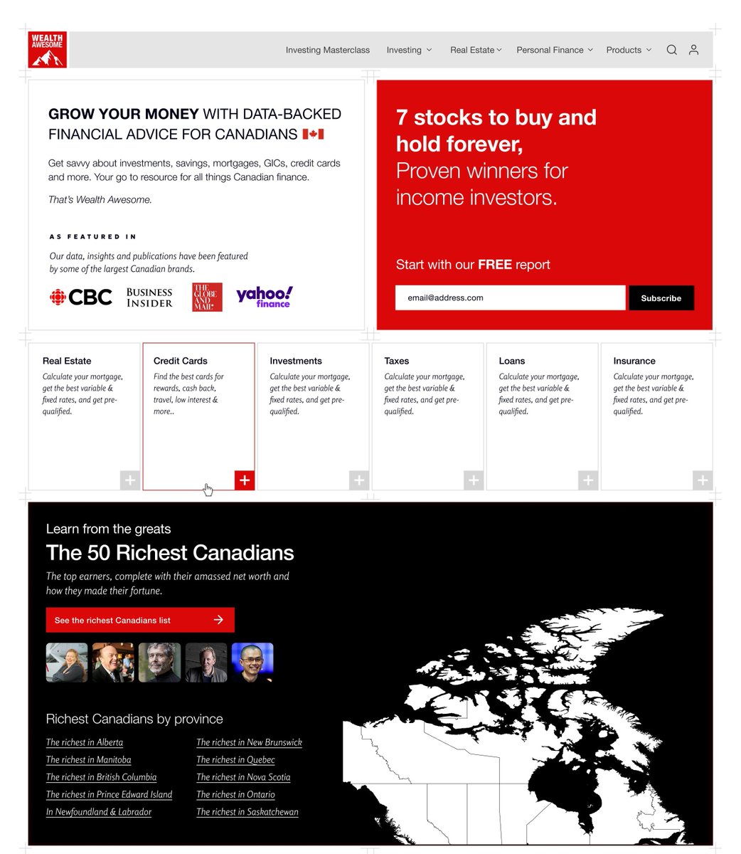
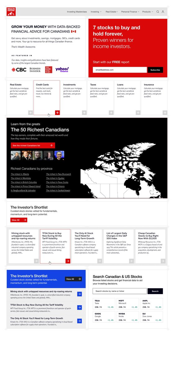
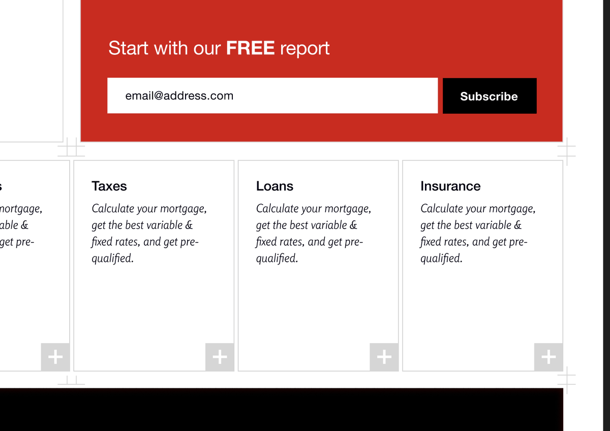
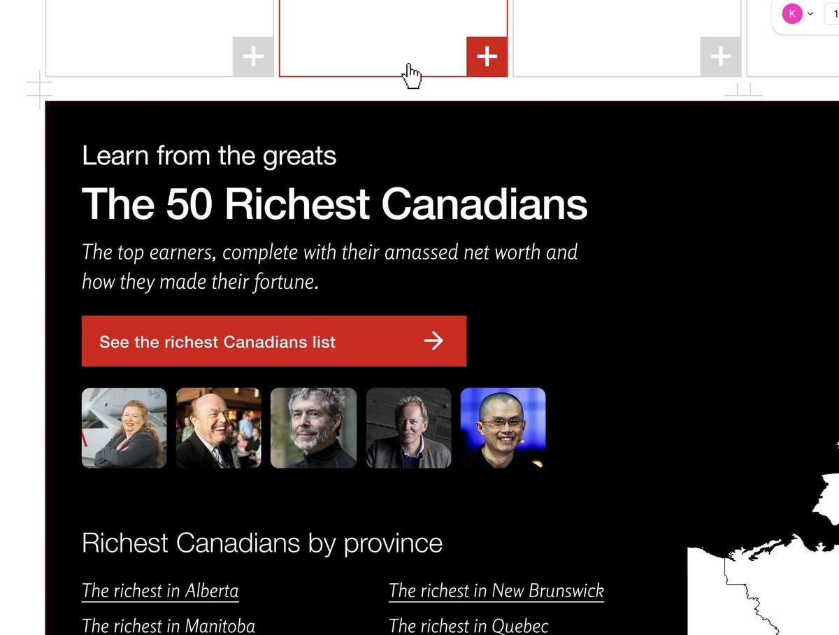
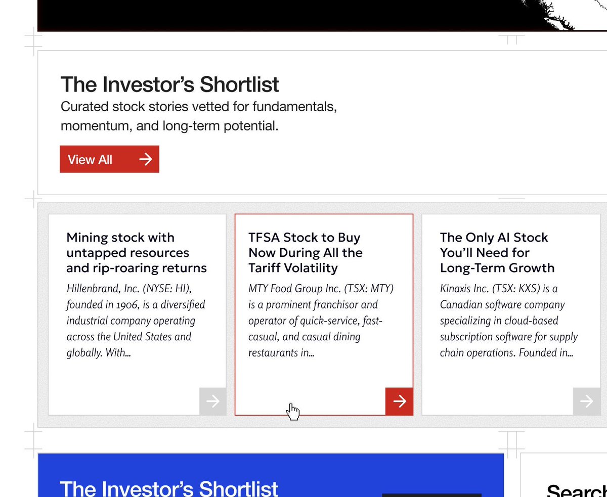
This time I wanted to lean in on the Swiss design style. A very strong grid. Maybe the grid even reveals itself to the user. I wanted bold colors, but also sophistication in their use, which I felt was lacking in the last iteration.

Wealth Awesome build update
Kumail
Kumail @kumailht · May 19, 2025

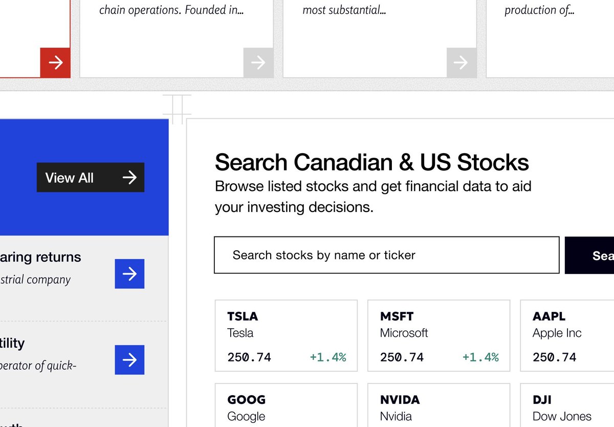
I also had an idea which I think worked REALLY well. The idea was to create these "responsive blocks" of data or content. This personal finance website is a data+editorial website and the hard part was trying to map out how all the information should be presented to the user.

Wealth Awesome build update
Kumail
Kumail @kumailht · May 19, 2025

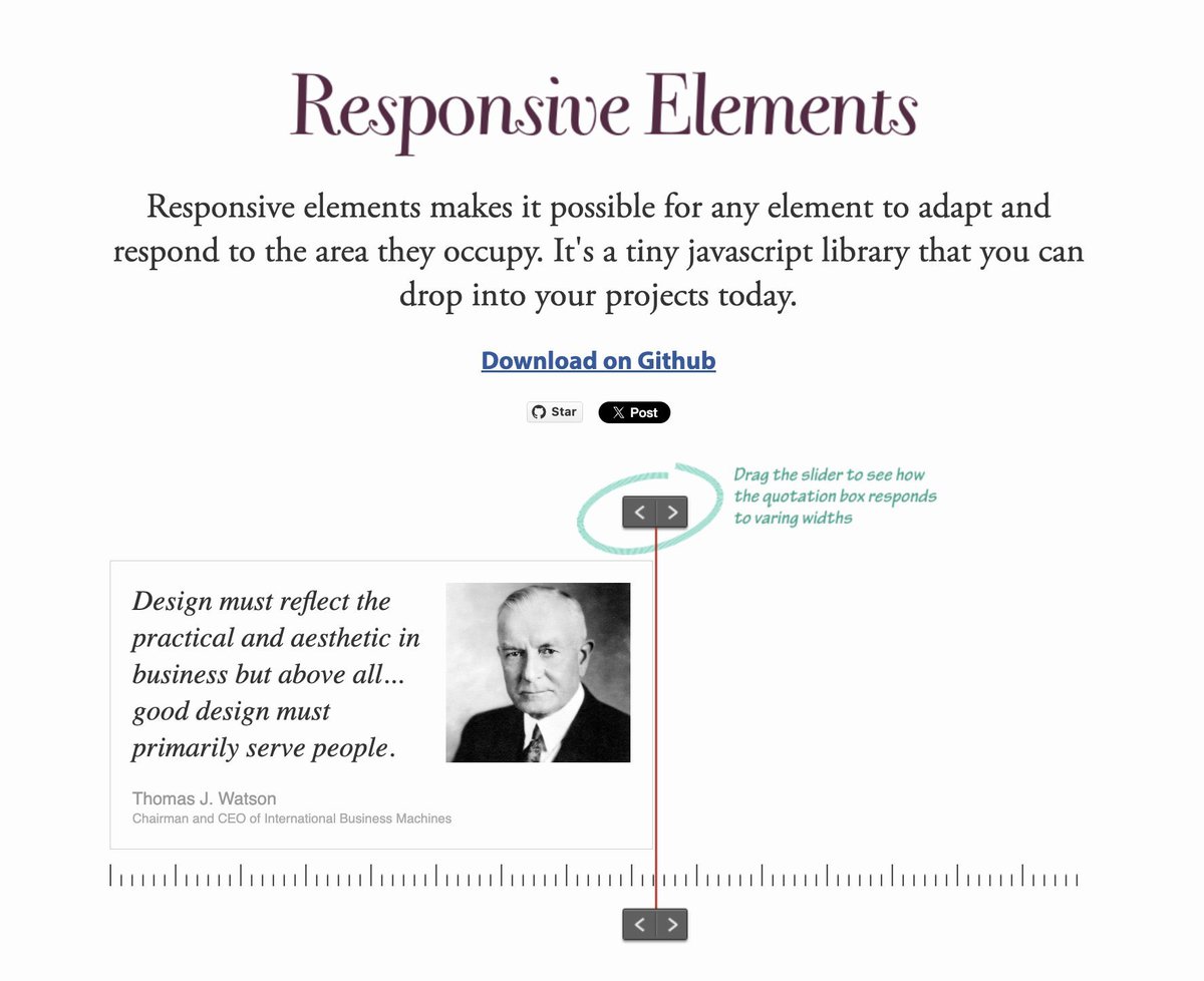
The concept of "responsive blocks" is something I've had many years ago when I launched Responsive Elements. And this is a similar idea. https://t.co/WJtd3FojAx

Wealth Awesome build update
Kumail
Kumail @kumailht · May 19, 2025

The idea is that every section or piece of data or content may need to shown many times on different pages So by having these reusable building blocks, we can make very complex web pages with lots of data & content, but also keeping the design and development process manageable.

Wealth Awesome build update
Kumail
Kumail @kumailht · May 19, 2025

This design has come out even better than I expected. The swiss design style works exceptionally well for this personal finance brand. The red is bold, but not overwhelming. The sections flow beautifully, and the design looks clean and authoritative.

Wealth Awesome build update
Kumail
Kumail @kumailht · May 19, 2025

I think this will be a fresh start for Wealth Awesome and can't wait to see how far they take this brand. I'm taking on more projects in June. Happy to get on a call and show you some of my past work if you're interested. DMs open.

Kumail
Kumail @kumailht · May 20, 2025

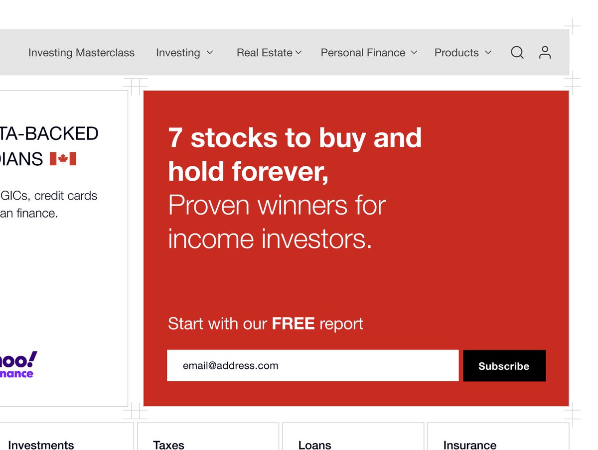
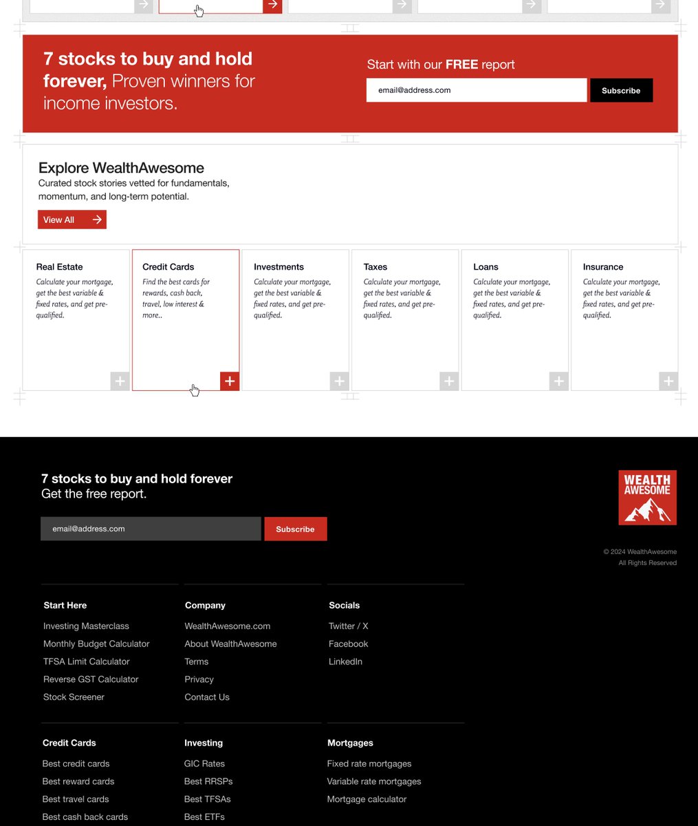
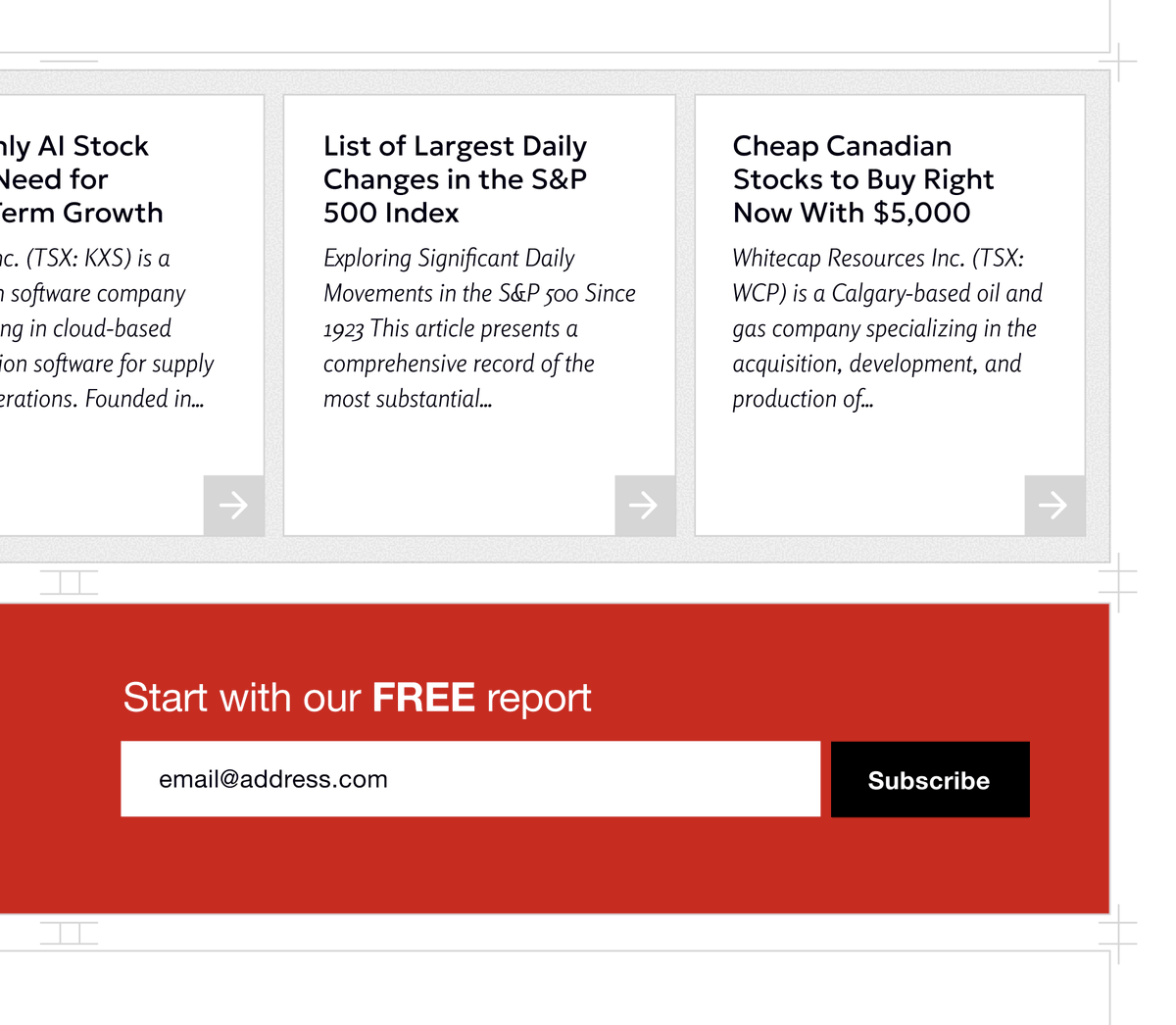
I learned something interesting from @qayyumrajan Don't just say "Signup to the newsletter" Instead, offer something of value that they get when they first signup. And it'll convert a lot better! That's why Wealth Awesome has the biggest lead magnet "7 stocks to buy.."

Wealth Awesome build update
Kumail
Kumail @kumailht · May 22, 2025

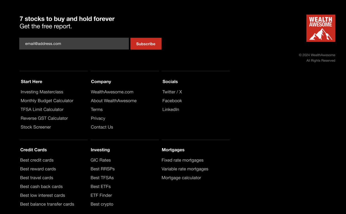
The footer is an opportunity I'll ask for the email, again. I'll give them a sitemap, which helps the user explore the rest of the website. Just little details to increase: - newsletter signups - time on site - pages viewed Make sure your footer isn't just a copyright notice.

Wealth Awesome build update
Kumail
Kumail @kumailht · May 27, 2025

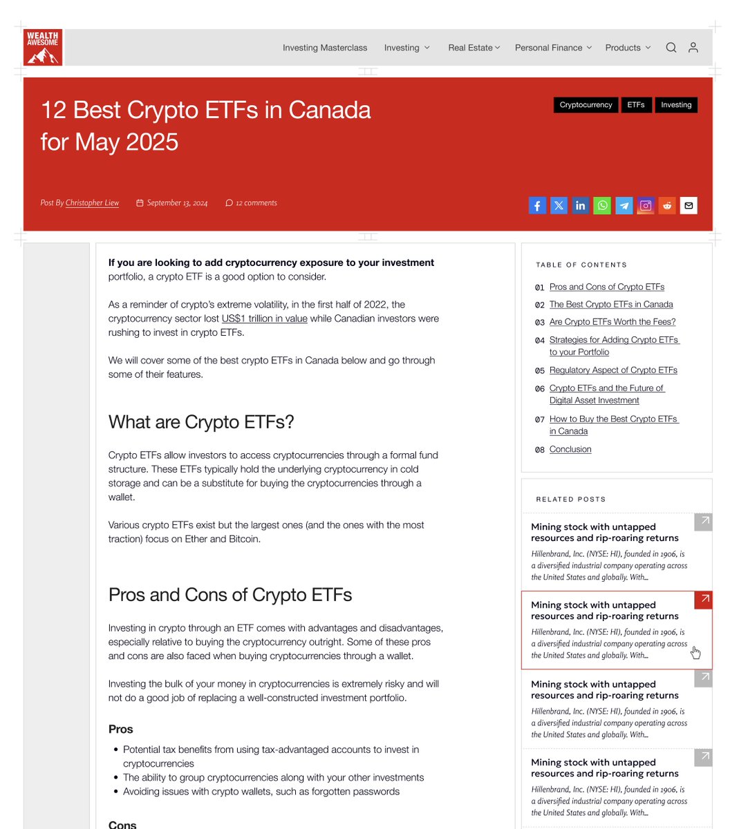
The detail page came out great for @WealthAwesome For those who don't know, Wealth Awesome is a personal finance website for Canadians. The client Qayyum Rajan, CFA loved how these turned out and honestly I really think this is some of my favorite work ever.

Wealth Awesome build update
Kumail
Kumail @kumailht · May 27, 2025

I love the Swiss design style, and while I've learned from that style and used some version of it all of my work, whether it's strong grids, bold colors or crisp type, this one really excels at all of those.

Wealth Awesome build update
Kumail
Kumail @kumailht · May 27, 2025

The design system also works like "lego blocks" so it'll work really well into the future, even with new content and features that we cannot anticipate today!

Wealth Awesome build update
4 WEEKS LATER
Kumail
Kumail @kumailht · Jun 25, 2025

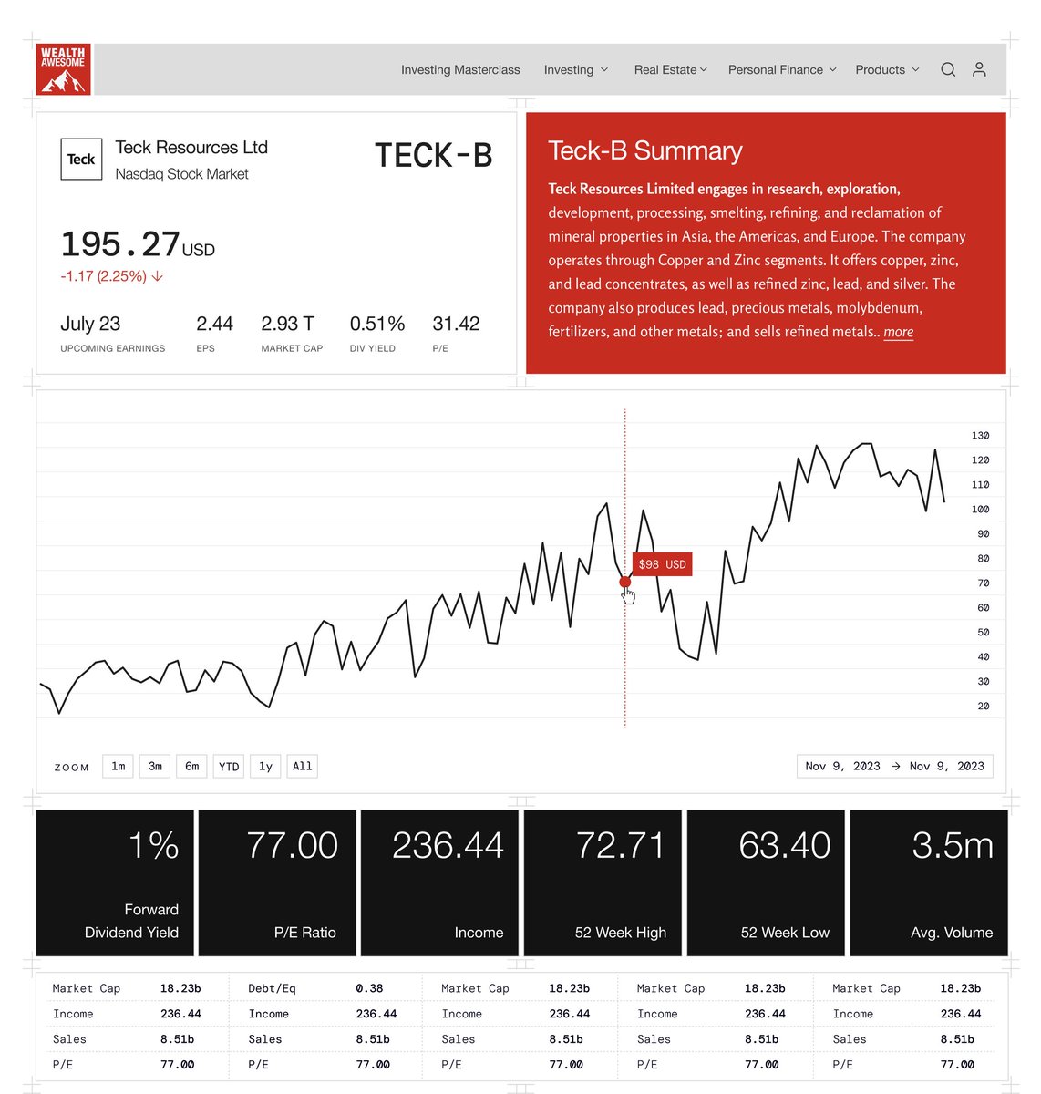
Working on a stock summary page for WealthAwesome, what do you think?

Wealth Awesome build update